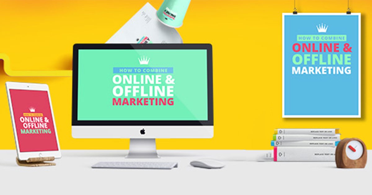
Businesses require marketing to be successful. In today’s age, every business needs to have a great looking website design to attract visitors.
Remember, websites are the best channels to promote your business 24 X 7. They act as your first impression in front of your target audience. This is the reason you should focus on website designs to make it the best website in the world.
No employee will ever do that. Hence, it is imperative that you create sites that sell. Website Designs play a huge role in increasing your engagement rate. If you have the best website design, there are chances for you to get more engagements plus conversions.
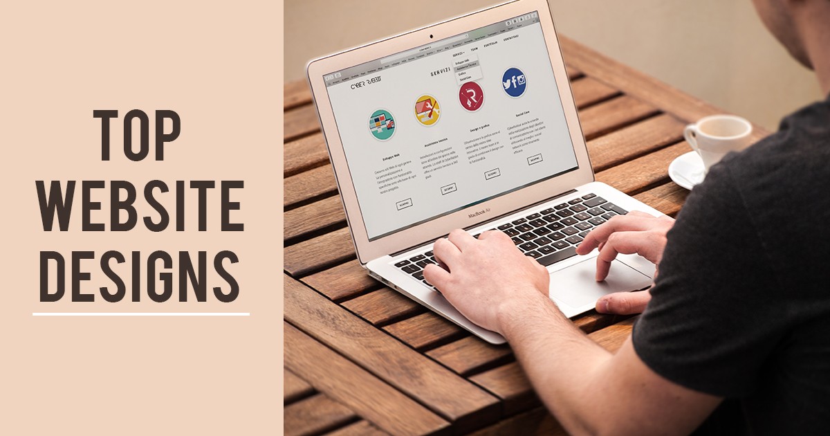
To conduct an initial search for creating website designs, you can take the help of some good website design examples online.
Milton Glaser, one of the most celebrated graphic designers in the US, had said once, “There are three responses to every piece of design – Yes, No, and WOW! Wow is the one to aim for.”
Here are the top 10 best websites.
Top 10 Website Designs
1. Broken Grid Layout
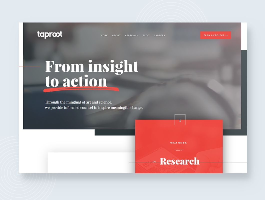
Every designer worth his/her salt knows that you need grids to create organized and reliable websites. However, we are in the age of experimentation where designers are not afraid to try something out of the ordinary.
One such attempt is the Broken Grid Layout. Such layouts blur the strict lines of the standard grids while retaining some part of the structure. The best aspect of these type of website designs is that images and text overlap thereby mixing on the screen more fluidly.
See how the images overlap to create a better and more compelling visual user experience. Breaking the grid allows users to interact with your website. The bold colour choice makes this design one of the trendsetting and best website designs.
2. Illustrations at the centre of the screen
Illustrations are crucial aspects of any website/homepage design. The best-looking websites in the world concentrate more on the images to do the talking. Images are powerful as they bring abstract concepts to life.
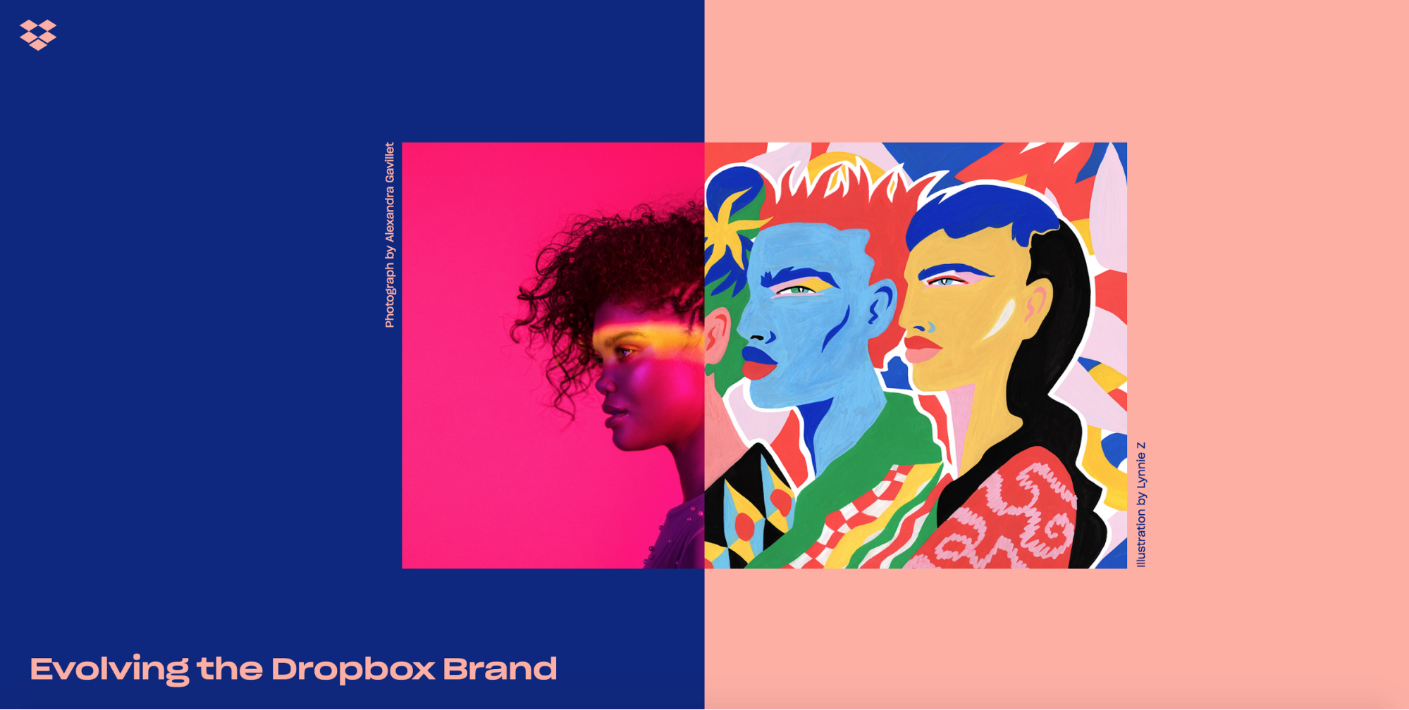
Image selection and placement are critical when it comes to designing the best website in the world. The best website in the world is the one that has the illustrations in the centre of the screen.
Automatically, it focuses the attention of the customer towards it. Note that illustrations resolve some of the representational challenges posed by photography admirably.
The Dropbox design should qualify as one of the top 10 website designs because of its new illustration style. The style involves creating rough sketches using graphite and then pairing them with colourful abstract thereby bringing the creative process to life.
The use of the human form while leaving specifiers like gender, nationality and so on undefined makes this design unique and attractive.
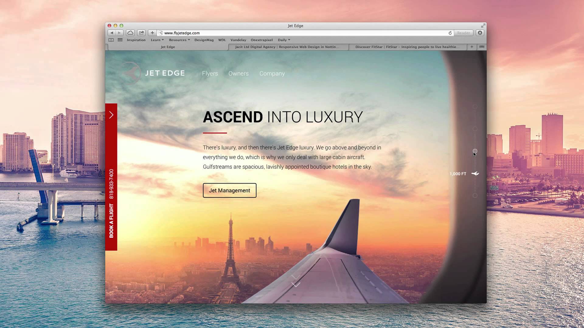
3. Organic and oblique shapes rule the roost
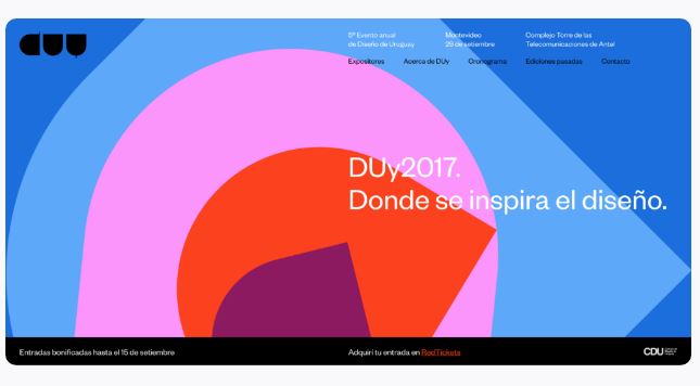
The card-based UIs have dominated both web and mobile designs for some years. You must have noticed that the cards were sharp-edged and right-angled.
However, things have changed over the past couple of years. The right angles have given way to rounded edges. These were not the only changes observed.
Nowadays, the best websites in the world use organic and oblique shapes with amoeboid blobs of colour. The dramatic diagonals and the cartoonish backgrounds have swamped the website designing scene.
You also have to flash colours to enhance the look of the website. The best aspect of using such designs and colours is that they linger in your mind even as you scroll on.
4. Animations and Interactions create a more significant impact
Creating static websites are a thing of the past today. Yes, you can say that static sites are enduring pieces of beauty, but the web allows for much more than printing words on a page. The information should move and more importantly, will enable you to interact.
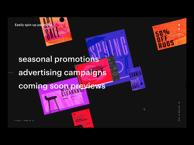
Animations are great because they can direct a visitor’s attention to the right content at the right time. Usually, you find two significant animation and interaction patterns, scrolling rates and page transitions. Designs that automatically highlight words are also extremely popular with users.
You also have websites where images move as you scroll. These designs are effective, but they can be overwhelming at times. Therefore, it is essential to avoid using them too much as it can frustrate some users.
5. Serifs are on their way back
There was a time when you had non-retina screen and poor font support. Therefore, the sans-serif fonts were the most sensible fonts to use.
You would find that the top 10 best websites in those days used have sans serif fonts. Today, things have changed a lot today with the font rendering technologies becoming more robust than before.
The soft curving serifs or the big bold headlines have become the favourite of users all over the world.
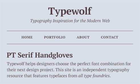
Any self-confessed fan of serif fonts will concede that serifs can evoke feelings of refinement, elegance, and literary polish. The serifs are indeed on their way back into fashion.
The Typewolf website is one of the good website design examples that use the serif fonts to make a statement.
6. Floating navigating menus
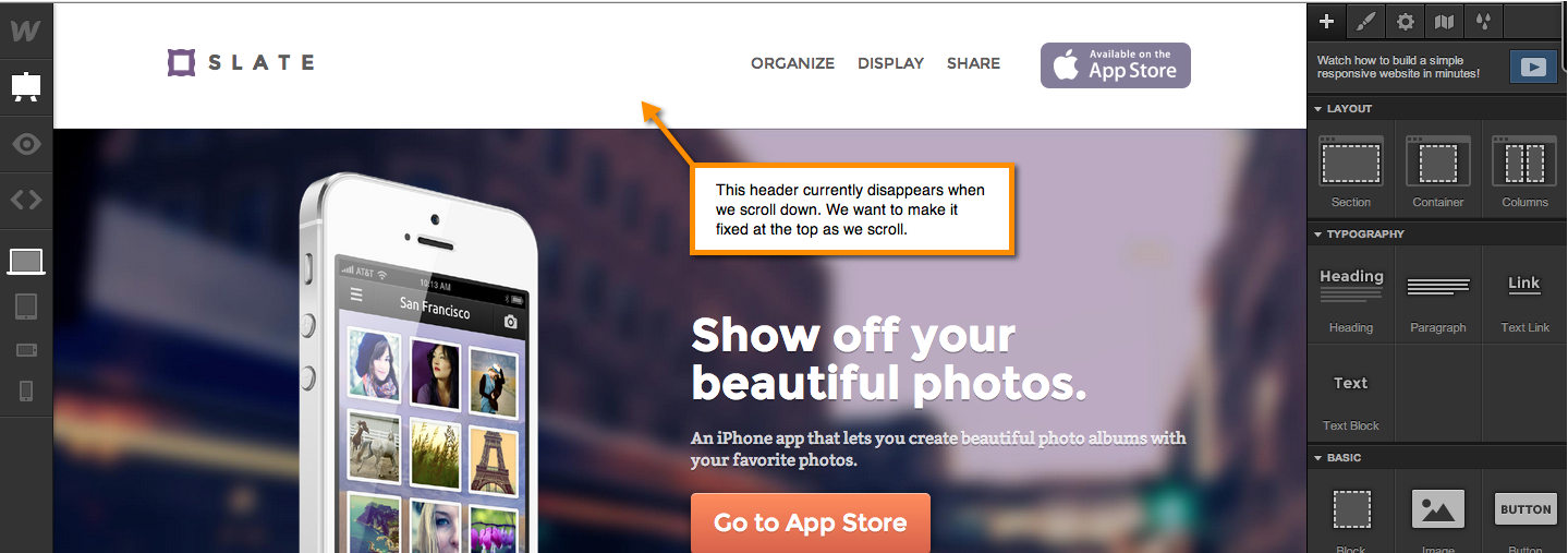
Usually, conversation-focused websites opt for the fixed navigation menus because the core CTA remains on the screen as you scroll.
However, with the changing times, we have floating navigating menus that are slightly detached from the top corner of the window and float a few centimetres below.
The principal idea behind this arrangement is that it gives the user a feeling that navigation is a universal topic. It also provides the impression that it sticks with you throughout your experience on the website.
Similar to the Broken Grid Layout, it allows for exciting juxtapositions to occur within the design thereby providing an element of fun as well.
7. Bring the video element into the web design
Pictures can say what a thousand words cannot. Similarly, videos are a hundred times more effective than mere static pictures. Hence, it is better to bring the video element into the web design. You have several reasons to do so.
- Videos seamlessly slip into the design, unlike the embedded YouTube presentations.
- Any day, videos are better than GIF images as you can add a lot of detail, colors, and gradients in the content thereby enhancing its quality.
- Looping the video content is possible so that the details of the copy and that of the image remain in synchronization.
Video element
8. Variable sized fonts
Not very long ago, you did not have fonts of different sizes. You had to rely on a handful of typefaces to deliver your textual content. Things have changed today with web designs providing you the opportunity to experiment with variable-sized fonts.
The four giant names in technology and typography, Apple, Google, Microsoft, and Adobe have come together to release variable fonts. It allows designers to interpolate a font’s entire glyph set up to 64,000 axes of variation such as width, weight, and so on.
John Hudson has provided the perfect definition of a variable-sized font. He calls it a single font that behaves like multiple fonts. This concept allows the font to go from thin to Black within no time, thereby saving the need to store 16 different fonts in your CSS.
9. CSS Grid
CSS Grid is another type of best-looking websites. The advantage of having a CSS grid design is that it allows for organizing content both into rows and columns. It is the first real layout system for the web. The CSS Grid gives the developers the full freedom to control the screens before us.
The CSS Grid is a guideline that defines new ways of implementing the technology. It is a much-improved version of the Flexbox. It is because developers can control both rows and columns simultaneously. Flexbox works from the content out whereas Grid works from the content grid in.
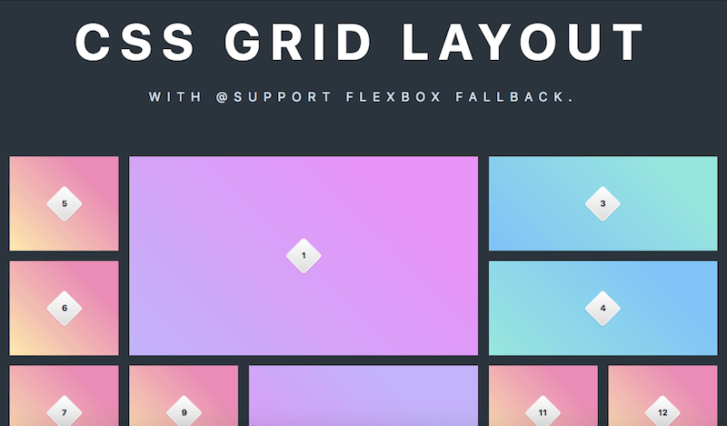
This freedom to experiment with various designs and templates make the CSS Grid layout as one of the best website designs. This design qualifies as one of the top 10 website designs.
10. Immersive multimedia long-form
Sometimes, you need long-form content to describe your products and services on the webpage.
In the olden days, you would insert the long-form text onto the page, especially when you have CMS to power your content. One single layout could be enough to support 200-word long-form content.
Now, designers have improved on this and are using custom layouts in combination with the presentation to tell long stories about your products and services using videos, sounds, graphs, charts, maps, and so on.
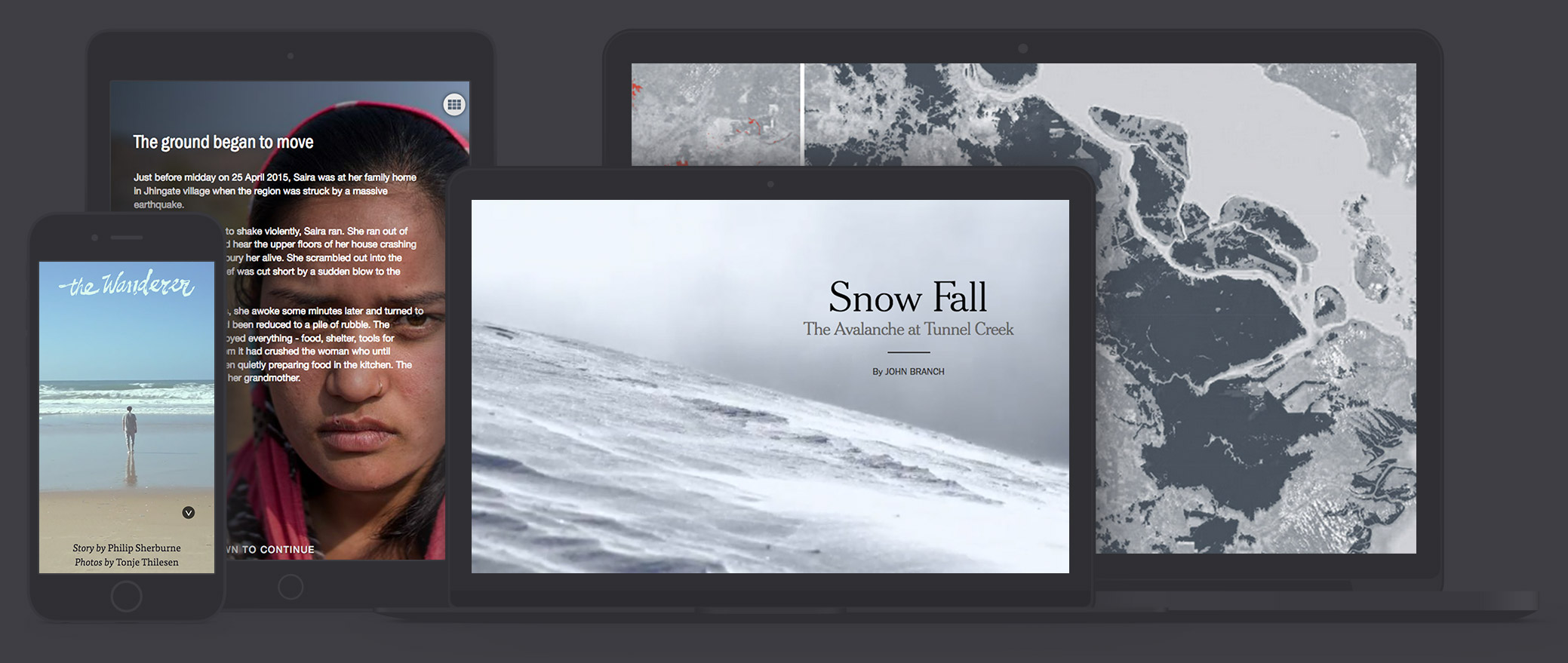
This immersive multimedia long-form design is gaining popularity today & is one of the good website design examples. It is poised to become more prominent in the years to come.
The advantage of using this web design is that you can deliver all the visuals of the story via background images and videos. Naturally, such a content model differs from the standard blog posts.
Turning a complex topic into easily-understandable paragraphs is easy. The best aspect of using such content is that it engrosses the user and makes them read every word of the content. Now, that is what you are looking for in any advertising campaign.
Final Thoughts
We have just seen the top 10 website designs that are popular. If you look at the top 10 best websites today, you will find them using one of the designs discussed above. “The first impression is the last one as well.”
Hence if you wish to have one of the best-looking websites, you should adopt any of these top 10 website designs so that people end up saying WOW.