Are you interested in pursuing Data Science? This introduction to Microsoft Power BI Tutorial Point will introduce you to the basic concepts and components of Microsoft Power BI, one of the most powerful Business Intelligence tool in the market. This is your first step towards the journey of becoming a Data Scientist, let’s get started!
Introduction to Microsoft Power BI – an Overview
Power BI is a cloud-based business analytics service. It allows the user to visualize and interpret data with higher rate, performance, and perception. Within minutes you can see your data in a new way thanks to content packs prebuild dashboard and reports by popular service providers like salesforce.com or Google Analytics.
And in one dashboard you will experience a live 360-degree view of your business. You can display your data in real-time from nearly any device across all major OS. You can set up mobile alerts to your phone when your data changes and share your data and dashboard with ease.
Drag and drop feature enabling you to go deeper with your data and explore in new ways by asking simple questions. There is no need to learn a new language with Power BI. Easily clean, shape and model your data to create powerful sharable reports.
You can connect to over 50 applications. Use power bi desktop to create a visualization, publish to power bi service and let users connect to the power bi dashboard and access the data using their computers, laptops, tablets or even smartphones.
Introduction to Microsoft Power BI: The Components of Power BI
It consists of windows desktop application called Power BI Desktop. There is an online service called Power BI service and then there are mobile Power BI smartphone apps for windows, android, iOS devices. Learn through the introduction to Microsoft Power BI.
Power Query:
Easily explore, access, and convert public and internal data sources.
Power Query is the first component of Microsoft self-service BI system along with Power Pivot and Power View. It is a free add-on for Excel 2010 and 2013. In Excel 2016 it is a built-in tool to get and transform data. Power Query allows you to search and extract data from many sources- external and internal. Different data like excel data, json files, sql service, text files etc.
You can then process the data by applying the query like in SQL and then just pull back the data you need. You can clean, transform and combine data with other sources that are relevant. This data is then stored in the connection and then loaded in excel or model for further analysis in Excel, Power Pivot and Visualization with Power View.
Excel is the foundation of most business even after having the complex software. People import data into Excel and manipulate. This can be very time consuming especially importing external data. With Power Query Excel uses the data like never before.
Power Query will let you get data from any source including social media, open data, big data and then quickly transform that data into a usable form in Excel, the tool that we all are familiar with. Not only that, Power Query will help to do tasks like splitting and merging columns, replacing text and so and so much more. These queries can be saved and then used over and over again.
Power Pivot
Perform data modelling for in-memory analytics.
Large datasets can be overwhelming and intimidating. But with Power Pivot, Power BI’s powerful self-service data modelling feature. Now there is an invaluable tool that takes those vast quantities of data and turns that into your capable hands. It allows you to customize sophisticated data models with your newly acquired data in a familiar and flexible Excel environment.
With few clicks you can create relationships, custom measure, hierarchies and KPIs, even built your models with drop and drag diagram view. And because power pivot uses the in-memory technology you can easily perform lightning-fast analytics on hundreds and millions of rows at once.
Power Pivot works seamlessly with Excel allowing you to refresh your model with new data from Power Query to visualizing the aspects of your data models into Reports and Power View. You can even create models to be easily queried with natural language and in Power BI Q&A. The more data you have to model and analyze, the more you will love Power Pivot.
Power View
Analyze, visualize and illustrate data as an interactive data visualization using Power View.
Lets us understand Power View as a product and as a feature. The first is simplicity, you will find in Power View that it is designed to simplify use everywhere- one or two clicks for anything you need to do. No right clicks, properties etc.
The next is End-user orientation. Power View’s orientation paradigm is towards data exploration. In Power View, everything we do has an impact immediately on the work surface. As we can see how data looks we can explore and shape it and change it, and so on. So it is very much intended as an ad-hoc exploration rather than a batch reporting tool. Most of the outputs that we see are quite visual. It emphasizes on charts, graphs and animation, not so much just dumping out rows and columns of data.
Power View is focused on inner active visualization and graphical exploration of data. And then finally it is finally good at developing presentations. Produce a slight DAX of information and tell stories of data and not just dumping out output. Power View is a new feature. It fills a product gap by providing, visually oriented, single-click data exploration and presentation environment primary geared towards end-user use cases.
Power Map
Bring data to life with interactive geographical visualization.
You can download this component and start the work. It is pretty simple. The Data model I have is a Power Pivot workbook that has some information on snowfall information. Let’s take a look at the data model. Some fields are Age_group, District, City_code and so on. We predicted snowfall by districts in various states in India especially those that are close enough to the sandstorm origins to be affected by it. Another sheet gives a breakdown of populations in each fo these districts. If we compare any two of those we can understand which will be worse hit in order to be ready to help.
Command to create the map is under the Insert tab and the command is Launch Geoflow. That will launch the power map add-in. What this brings up is the initial view of Bing maps. The data views in the pan are coming from power pivot workbook. The way it is organized is in various layers. Start with layer one and give this layer a name like Population density and similarly do the same with other layers.
Power BI Service
Share data viewpoints and workbooks which are refresh-able from on-site and cloud-based data sources.
So there are few important concepts to understand when you are using Power BI service. The crucial things are workspaces, dashboards, reports, and datasets. Workspaces are a container that can have many dashboards inside them.
Those that are likely to be my personal workspace to hold information are the number of Reports, number of Dashboards, number of Datasets. A dashboard can have many tiles in it that are pulled from multiple different reports and each report is attached to one dataset and one dataset only.
For Example, I am logged into Power BI. Looking at one dashboard in my workspace, I can share things with other people from here. But typically this area is where we work from. It has got a number of different titles, maps, bar charts, doughnut charts. So like I said any of these tiles can be pinched onto this dashboard from multiple different reports.
Power BI Q&A
Ask questions and get instant answers with natural language query.
You can quickly create visual space of your data called Q&A whenever you are looking at a dashboard, you wanna ask questions about your data. You need to click on the box called “ask questions about data”. And when you are here, you can see first there are suggestions for questions you can ask.
For Example, I can click on Products and I will see a list of products and not only that, it will also suggest other questions like you can ask. Like I can see products by manufacturer. I can also click on any of these items that have an underline under it and exchange instead of products I wanna see bills by the manufacturer. The chart will update to show me sales of products. In Q&A it shows the best visuals of the data we are looking at.
Data Management Gateway
By using this component you get recurrent data refreshers, expose tables and view data feeds.
Microsoft Data Management Gateway joins on-premises data sources to cloud services for use. With Microsoft cloud services, such as Power BI for Office 365 and Azure Data Factory you get advantages including fast deployment, low sustaining cost, and adjustable billing model while keeping your company data on-premises.
With Data Management Gateway, you can attach on-premises data to cloud services in a safe and controlled way, to react more quickly to changing market needs with an adjustable, hybrid cloud platform. You can benefit from Microsoft cloud services while you keep your business running with the on-premises data.
Data Catalog
A user can easily identify and reuse queries using Data Catalog. Metadata can be aided for search functionality.
Introduction to Microsoft Power BI: Types of Connections in Power BI
Creating a dashboard is very simple, thanks to over 50 connections that you can use which consists of 50 popular business applications.
Here is the list of popular services from the Microsoft website.
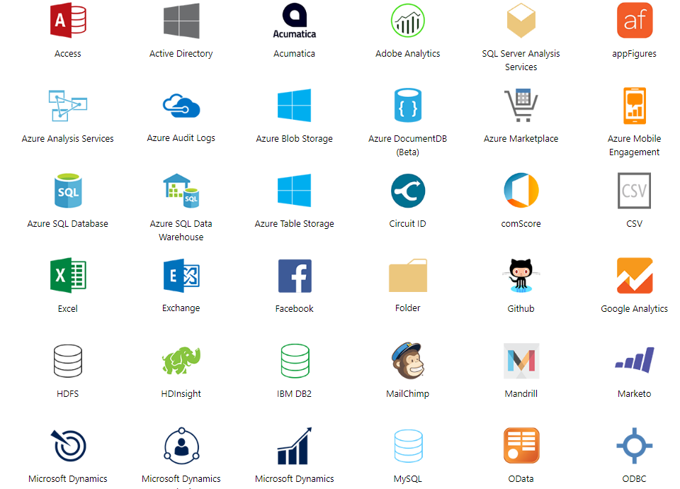
and many more…
Having these data connections readily available makes the life of data analyst that much easier.
Introduction to Microsoft Power BI: Power BI for All
For Analysts
Analysts can use it to go from Data -> Insight -> Action. Hundreds of sources can be connected with, data can be prepared with ease, and beautiful reports can be made, all in minutes.
For Business Users
Dashboards can be viewed on the web or on your phone helps you to be always in the know. You can set an alert notification when data changes and reach the details. You can control and manipulate the data at your fingertips.
For IT (Information Technology)
You can give other users access to the insights they require while keeping the data secure by simplifying management and compliance achievement
For Developers
Interactive data visuals can be easily embedded and beautiful reports can be delivered with high fidelity on any device making your apps feel alive with data.
Introduction to Microsoft Power BI: The Concept of Power BI
A good understanding of the following would help you understand concepts and will let you create detailed and complex reports
Datasets
Dataset is an accumulation of data or information. Power BI harnesses this information to create visualizations. It can be a mix of numerous different channels or a pure dataset. This can be screened and blended to give a different dataset completely. The dataset is an aggregation of data and Power BI utilizes this information to make visualizations.
For example, one can gather information from various channels such as an excel table, databases, various email surveys, and social media platforms.
Visualizations
A visual depiction of data is called visualization. For example, a chart or a graph can be used to interpret data visually. Power BI gives you different visualization types, which keep getting modernized with time. The following shows some generally used visualizations:
- Map representation
- Card visualization
- Stacked area chart
- Treemap
- Pie chart
Visualizations can be plain or they can be visually detailed.
Reports
The aggregation of visualizations that come out collectively on one or greater number of web pages is the Power BI report. It is an accumulation of hidden insights, patterns, and unknown correlations.
You can create visualizations, on more than one different page if necessary, and arrange them in a way that entertains your narrative best.
Dashboards
A Power BI dashboard is a single-page interface. It is often called a canvas, that uses visualizations to tell a narrative. Because it is limited to one page, a well-designed dashboard contains only the most important parts of that narrative.
The visualizations you see on the dashboard are called tiles and are clasped to the dashboard from reports. In Power BI, a tile is a single visualization found in a report or on a dashboard. It’s the rectangular box that holds each individual visual. Power BI gives you the liberty to move or arrange tiles, so you can exhibit the data the way you want to, even while you’re building a report or a dashboard. You can make the tiles larger, adjust their height or width, and nestle them up to other tiles the way you want.
Cost of using the Tool
We can see that Power BI service has a free version and a professional version. So let’s take a look at some of the differences between the two versions. Both versions allow creating and sharing dashboards. Basically, you can access dashboards on mobile devices, you can import data from various files and you can publish to the web.
The most basic difference here is the data capacity limit. The free version is 1 gig per user whereas the pro version provides 10 gigs per user. And the cost of the pro version is $9.99 USD (approx. ₹638 INR).
Featured In
![]()
Microsoft is recognized as a leader in the Gartner Magic Quadrant for Business Intelligence and Analytics.

Power BI wins Editors’ Choice in the PCMag.com self-service BI tool review roundup.
Testimonials
![]()
“With Power BI, we can very quickly and easily create reports and dashboards that tell quite a compelling story.”
-RICHARD BEESLEY, SENIOR ENTERPRISE ARCHITECT DATA SERVICES
https://youtube.com/watch?v=B3CZXp-RK0g
![]()
“With Power BI, we were able to see where we were significantly behind the regional trend, focus on the problem, and create a solution.”
-MATT CRAIG, REGIONAL VICE PRESIDENT–EASTERN REGION
![]()
“Using Microsoft BI and analytics tools helps us make better decisions and save more children’s lives.”
-STEPHANIE BRUNO, DATA ARCHITECTURE MANAGER, INFORMATICS AT EGPAF
https://youtube.com/watch?v=JxHHgOQfrs8
So this was about the introduction to Power BI with basic concepts and key terms, now I am going to take this Power BI tutorial a step further with a demonstration of creating a simple report using Power BI Desktop. We will learn all this and more in the next post. So stay subscribed and don’t miss.
Meanwhile, check out the following interesting posts to give you a general perspective on cloud-based services and analytics
An interview with Soumyajit Dey – Digital Lead Cloud Performance Marketing, IBM
Salesforce Analytics Cloud Doubles Down On Big Data
Photo credits: Microsoft
Official sources: https://powerbi.microsoft.com