We all have some of the other time used Charts in Excel, but always struggle with when it comes to growing data. Once the data starts growing, we want to see the effect of the growing data on the chart immediately without having to do any manual settings every time. Plus, we want to be able to slice the chart to see whatever we want to see at that point in time. This is where slicers come into the picture. Here, learn about Excel Slicer.
Before we get into the slicer-controlled extravaganza, let us understand a bit about charts and how to make them interactive.
Excel charts make it very easy to visualize all the data that is entered into spreadsheets. They also help to summarise the data. You would need to read through a lot of data to understand what is happening. But with a chart, you can grasp this at a glance.
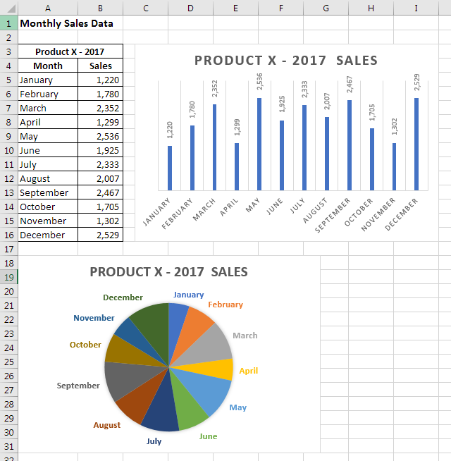
Charts are pretty easy to make – just select data and select an appropriate chart type from the Insert Tab. In recent versions of Excel, you even get an option to recommend a chart, based on the type of data you have. From the various types of charts, always select the chart type that makes the most sense for the data that you want to portray. For example, if you have monthly sales data for Product X, using a pie chart would not make any sense. It is much more advisable to use a bar, column or line chart.
Because of its advantages, it is very common to present data using charts. Now, the thing about charts is that they are linked to a fixed source of data. So, whenever new data is added, the chart will not take that into account automatically and therefore does not update itself. In other words, charts are by default, static. Now, let us look at how to make them more dynamic and interactive.
Auto-updating the source data
The problem of growing data is easily fixed by converting the source data into an Excel Table. One of the features of an Excel Table versus a normal data range is that it can accommodate new data, while still retaining the same reference. This means any amount of new data added will still only be a part of that particular table, without having to manually increase the selection of the data range. Hence, if a chart is linked to a table, and growth of data will be updated in the chart automatically.
To understand this, let us look at a simple inventory that records the in-flow and outflow of Item A. To convert a range of data into a table, select it and go to the Insert Tab > Table. This will reformat the data and add filter dropdowns to it. Another indication is a new Tab that appears on the menu (ribbon) called Table Tools -> Design.
Next, select the data and insert a line chart, normally through the Insert tab option.
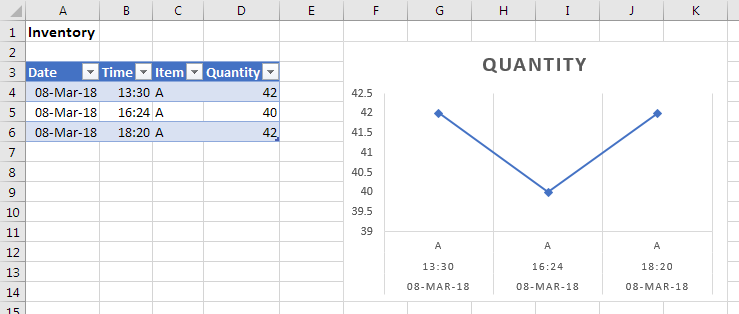
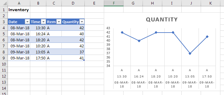
If new data is entered just below the existing data, it will be recognized and updated in the chart automatically:
As you can see, charts depend on how the source data is maintained. Any changes in the source data will reflect in the chart. The data essentially controls the chart. This means the data can be manipulated to bring about changes in the chart. This is exactly how interactivity is brought to charts – by changing the source data. For example, filters can be applied to the source data, which will change the chart to reflect only the filtered values:
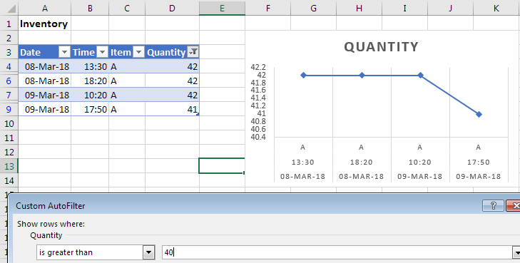
In the screenshot above, a number filter is applied to show only values greater than 40.
Quantity column drop-down -> Number Filters -> Greater Than -> 40
This also reflects in the chart. All these filters can be used to great effect, but they can become cumbersome and clunky to use – especially when there are multiple columns to filter. Just imagine yourself presenting some data in a meeting with everyone waiting and looking at you while you click each filter’s button to show data that is required. This can be overcome by using the slicer tool in excel.
Slicer Basics
Essentially, by creating slicers in Excel, you are doing the same thing as filtering; by using a different interface. They are available only in Excel Tables and Pivot Tables. Let’s try this on an Excel table first:
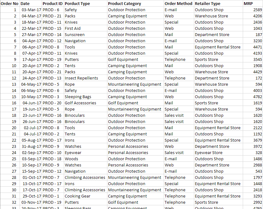
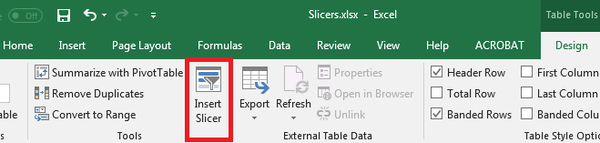
This is sample sales data taken from an outdoors & sports equipment company. It has various products that fall into multiple categories and types. They are sold through multiple types of retailers & order sources. Click anywhere inside this data and press Ctrl + T to convert it into an Excel table. Make sure the “My table has headers” is checked. Next, go to the Table Tools – Design tab and click on “Insert Slicer”. In the dialogue that comes up, select “Product Category” and click OK.
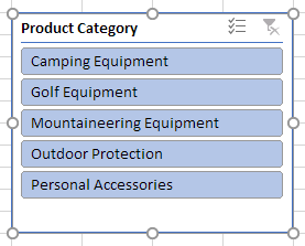
Immediately, a box with a unique list of product categories appears. This is how to insert a slicer in Excel. If you click on one of them, you will see the data will get filtered. To clear the filter, use the clear button on the top – right of the slicer.
You can hold the Ctrl key on your keyboard while clicking on items to select multiple items. To select a few consecutive items, you can simply click and drag down to select more than one item. The slicer object can be moved and resized just like a chart object can.
Excel Slicer Tricks
Let’s see a few more capabilities of slicers before we look at interactive charts. The first thing to note is that slicers work on pivot tables too. Keep the cursor in the raw data and insert a pivot table by going to the insert menu or using the keyboard shortcut Alt – N – V and enter. A new sheet with an empty pivot table is made.
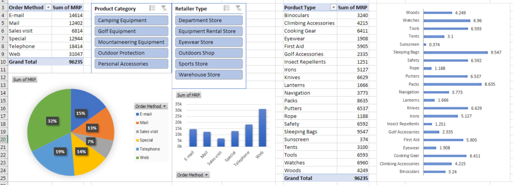
A pivot table is basically a way to summarize data to create reports. The pivot table field list on the right shows all the headers from the source data. From here, select order method and MRP. This will create a report that shows how sales happen through each method of placing orders. If you see the bottom half of the field list, you will see, the order methods are in the ‘Rows’ area and MRP is in the ‘Values’ area.
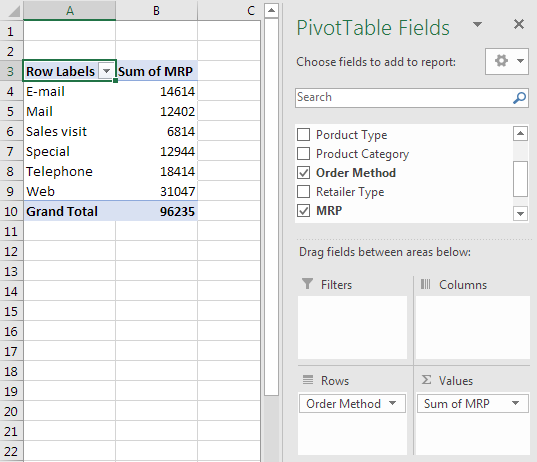
Once the report is created, a slicer can be added for product categories. There are a couple of ways to add a slicer in a pivot table – first by going to the Insert Slicer button in the Analyse Tab in PivotTable Tools. Another shorter way is to right-click a field in the pivot table field list and choose ‘Add as Slicer’.
As you click on each product category in the slicer, you will see the report update to show MRP values for each order method, within each category. Can you imagine what would happen if a chart was added to this pivot table?
Interactive Charts
Why imagine when we can do it and see for ourselves! First, clear the slicer, then click inside the pivot table and go to the Insert Tab and choose the first column chart. When you click on any product category in the slicer, you will see the chart interacts!
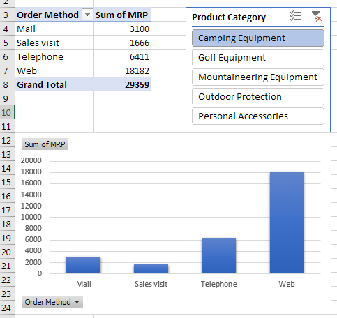
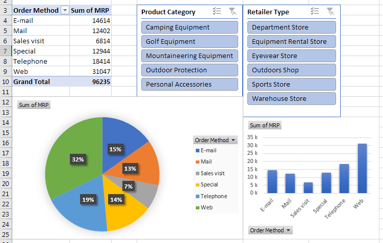
Using the same setup, we can add another slicer to filter the numbers further. Click inside the pivot table, right-click ‘Retailer Type’ from the field list; and choose Add as slicer. This clearly shows all retailer types available for whatever product category is chosen. Did you notice, it also shows every other retailer type that has no data, unlike filters.
In fact, while we are at it, we can even add a pie chart to see a breakup by percentage for all the different order methods. This is a design pre-set available for all pie charts.
Finally, create a Dashboard
We saw how to add slicer in Excel and how to use slicer in Excel. We also saw multiple charts. Now let us see how to use these with multiple pivot table reports. Let’s create a new pivot table from the original Excel Table. This time we will add the pivot table in the existing worksheet with the other pivot table. To do this, choose the ‘Existing workbook’ option from in the pivot table dialogue box and choose cell H3, just to have some distance from the existing charts. In the pivot table field list, select product type, and MRP.
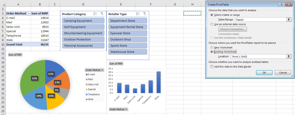
Connect Slicers to multiple pivot tables
Because both the pivot tables have the same source data, the slicers created on the first pivot table can be connected to the second. To do this, right-click on a slicer and choose ‘Report Connections’. Select the second pivot table and click ok. Do the same for the second slicer too. Now when you use a slicer, both the pivot table reports will react to it!
If a simple bar chart is added to the ‘Product type’ report, it will also react to the slicer.
Conclusion
Now, you finally know how easy it is to create slicers in Excel. To summarise, properly formatted source data is what enables everything. Charts rely on it to provide some visualization. Filters provide a way to slice the data and we can see only what we want to right now. Excel slicers essentially do the same thing but in a much more user-friendly and interactive way. It can also connect and control multiple pivot table reports. And since the data changes, the charts react and become ‘Interactive’. So, have access to the best Certified Data Analytics Course to arrive at the best results.