
In this Power BI Training post, we will go through various aspects of Microsoft Power BI Training to understand the concept and working of Power BI. Power BI is a cloud-based business analytics service. It allows the user to visualize and interpret data with higher rate, performance, and perception.
Drag and drop feature enabling you to go deeper with your data and explore in new ways by asking simple questions. There is no need to learn a new language with Power BI. Easily clean, shape and model your data to create powerful sharable reports and dashboards.
This Power BI Training overview will get you ready so you can confidently enrol in the full training module. You can find the link at the end of this post. I am sure after reading this post you will be intrigued to know more and deep dive into the Business Intelligence Course.

Power BI Training components consisting of Power BI Desktop, Mobile App and Power BI Service
The key components of Power BI are as follows,
Power Query – Easily access, explore and convert public and internal data sources
Power Pivot – Perform data modelling for in-memory analytics on hundreds and millions of rows at once
Power View – Analyze, visualize and illustrate data as an interactive data visualization using Power View
Power Map – Bring data to life with interactive geographical visualization
Power Pivot is a powerful self-service data modelling feature that allows you to customize complex data models with your newly acquired data in a familiar and flexible Excel environment. With few clicks you can create relationships, custom measure, hierarchies and KPIs, even built your models with drop and drag diagram view. You can easily perform lightning fast analytics on hundreds and millions of rows at once.
Power View’s orientation paradigm is towards data exploration. It emphasizes on charts, graphs, and animation. Power View is focused on inner active visualization and graphical exploration of data. It is good at developing presentations. It fills a product gap by providing visually oriented, single-click data exploration and presentation environment primary geared towards end-user use cases.
Power Map data model: For illustration, you can add some product sales information (for example smartphone sales information) and also some geographical information. It’s important you know either the postcode where the transactions took place or the name of the town which will allow the Bing mapping application within Power Map to locate each data point on the map has created a data model.
The Power BI tools are Microsoft Power BI Desktop, Power BI Service and Power BI Mobile
The Power BI Desktop is a local application which is available for free download on the Microsoft website. In this application, you can connect Power BI to different sources to analyze and visualize the data. After local work is done you can publish it on Power BI Service, which is a cloud application. You can also use Power BI Mobile App to access your projects from mobile devices like smartphones and tablets.
Microsoft Power BI Training – How to install Power BI
You can download the windows application from the link below,
Basic Features of Power BI
Microsoft Power BI has characteristics that can provide compelling insights with an interactive visualization,
- Power BI Desktop gives an option of cloud data sources and on-premises. Its nature may be unstructured or structured.
- Data model, embedded queries and dashboard reports are some of its content packs inclusions (from R and SQL).
- The user can write questions and the software will provide the content and answer accordingly. To match user’s needs, it can be customized and manipulate
- Printing dashboards is a useful feature when it comes to presentations while in board meetings and discussions.
- It has more than 200 functions and it keeps on growing. The analytical data models are created using the rich DAX formulas.
On opening the Power BI Tool, the following pieces make up the start screen for Power BI service
1. Report – Power BI Report is an accumulation of hidden insights, patterns, and hidden correlations. It is the aggregation of visualizations that come out collectively. You can create visualizations, on more than one different page if necessary, and arrange them in a way that satisfies your narrative best. With Power BI, we can very quickly and easily create reports and dashboards that tell quite a compelling story. Using Microsoft BI and analytics tools helps us make better decisions in treating patients.
![]()
2. Data – The second icon in the left pane shows us the full dataset which got imported to Power BI. The dataset includes the fields along with the records.
![]()
3. Relationship – The third icon to the left pane is the relationship icon. Clicking this icon, we can create and see relationships between the tables. It is quite useful when we import more than one related datasets in Power BI.
![]()
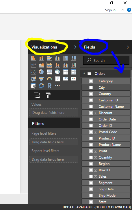
4. Fields – This icon is in the extreme right. This shows all the tables and their respective fields or attributes of the dataset imported. From this place, we can drag and drop the fields on our canvas to see real-time changes in our visualizations.

5. Visualizations – On the main screen of Power BI Desktop, on the right, you will find the visualization pane.
Popular Power BI Data Visualizations are –
[1] Stacked Bar Chart [2] Stacked Column Chart [3] Clustered Bar Chart
[4] Clustered Column Chart [5] Line Chart [6] Area Chart
[7] Stacked Area Chart [8] Line and Stacked Column [9] Chart
[10] Line and Clustered Column Chart [11] Waterfall Chart [12] Scatter Chart
[13] Pie Chart [14] Treemap [15] Table
[16] Funnel [17] Gauge [18] Multi-Row Card
[19] Card [20] KPI [21] Slicer
[22] Doughnut Chart
6. Page No. – On the bottom of the screen, there is a place where you can enter the name of the particular page. “Page 1” is the default name provided by the tool. You can right-click on it and click rename, to change the page name.
Key features in a Power BI dashboard
1. Navigation Pane
The vertical window on the left of the workspace is the Navigation Pane. Via it, you can move between your workspaces, reports, data sets and dashboards
(1.1) Get Data – Used to add datasets, reports, and dashboards to Power BI
(1.2) Favorites – Mark and later open your favorite content
(1.3) Recent – View and open your recently opened content
(1.4) Apps – View, open or delete an app
(1.5) Shared with me – search and sort the content you want to find
(1.6) Workspaces – select to display and open your workspaces
2. Canvas
If we open a dashboard the canvas area displays visualization tiles. On opening the report editor, the canvas area would display a report page.
3. Q&A question box
You can use this to add content to a dashboard or report. You can ask a question and Power BI Q&A would give you an answer in the form of a visualization. It essentially looks for an answer in the dataset connected to the dashboard.
4. Icon buttons
The icons in the upper right corner are the support for notifications, settings, getting help, providing feedback to the Power BI team and downloads.
5. Dashboard title
To figure out which are the active workspace and dashboard, Power BI creates the navigation path for you.
6. Office 365 app launcher
From here you can instantly launch your documents, calendar, emails, and all your Office 365 apps.
7. Labeled icon buttons
This area contains supplementary options for communicating with the contents. Options for printing, duplicating, refreshing the dashboard etc.
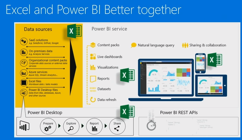
Use Microsoft Excel and Power BI together to build powerful, consistent reports & visuals
At first glance Excel and Power BI seem two separate tools but if once you learn something in one of these tools this will be very useful for you if you choose to use the other. Once you go and use a systematic scan of the capabilities of combining Excel and Power BI you can see that if you import or connect your Excel workbooks to Power BI you gain a match of each other and you can do more, like Cortana Integration.
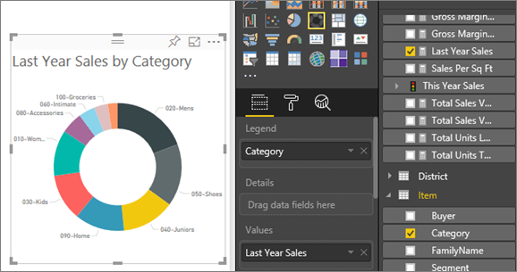
Power View – Strengths of the package
It’s so quick to use. As soon as you click on a column in your underlying Power View fields it will add it into what’s called a visualization and you can see that it would immediately give you a table of the total quantity of sales by region and model numbers. The chart, we can easily change it and it immediately updates so it’s very quick when sitting with a client to show them what their data could look like.
Power View – Weaknesses of the package
If you type in a title for your Power View report and then you want to format it, you can change it to underlined, italic, change the font size, justification and so on. What you can’t do is change a color or the background or the border or anything else and that’s the same for every part of Power View
Case study
- Install Power BI Desktop as instructed above.
- Get the excel file containing sample sales data ready. (You can download it from the internet or make your own with fields like ‘Name’, ‘Model_No.’, ‘Company’, ‘Price’, ‘No._of_Units_Sold’, ‘Month’, ‘Year’ etc.)
- Open Power BI
- From the home tab, click on the option “Get Data”. Select the type of file you want to load. (Here, the example data set is in xlsx. Hence, choose the option “Excel”)
- A pop-up box appears. Select the tables you want to load from the mentioned dataset and click on “Load”.
- Under the “Visualization” tab on the right side we see all the types of visualizations available to us, to work on (like, bar chart, column chart, line chart, stacked area chart, pie chart, etc.). Select the visualization you need. Also, many “Custom Visualizations” are available to be downloaded freely and used.
- Drag and drop the fields you want to analyze, on relevant boxes thus provided.
- You can edit the visualization and make it more colorful and attractive, according to choice.
- After the visualizations are all ready, go to the “Publish” option on the top right. Sign in with your official power bi account, and then click on “Publish on Web”. The dashboard is created and published on the web.
- You can generate a link to the dashboard and share with colleagues, friends, or in public.
Conclusion
Digital Vidya offers one of the best-known Power BI online course for a promising career in Data Science. Its industry-relevant curriculum, work on Data by extracting it directly from the cloud, devise solutions to real-time industry problems are some of the best reasons for choosing this Business Intelligence Training Course. In addition, students also get lifetime access to online course matter, 24×7 faculty support, expert advice from industry experts, and assured placement support that prepares them better for the vastly expanding Data Science market.
Subsequent to joining our Power BI Training course, you will have the capacity to,
- Enhance your Analytics Skills and make a transition into the ever-growing Analytics industry.
- Learn Power BI and high demand tools such as Advanced Excel, and SQL used by more than 70/100 Analysts in Europe.
- Represent data visually and derive added value from your data possessions.
To know more, it is advised to enroll in our Power BI course.
Still doubtful about Power BI training course, or wish to clear any Power BI concepts– Ask us in comments
—
Image credits:
P E X E L S – Thousands of royalty-free images
Screenshots from Microsoft Power BI Desktop