I have been regularly talking about Power BI Data Visualization in my previous posts [1] [2] and have also demonstrated a few of them. In this post, I am going to list and explain the popular Power BI Visualizations provided by Microsoft BI Desktop. I will teach you how you can build dynamic dashboards in the most effective manner as per the dataset available to you. To illustrate all this I have taken two databases – one contains the ‘sales report’ of flagship smartphones and the other contains the ‘Smartphone Benchmarks’ (credits to Antutu Benchmark).
So let’s get started! You know the drill, Get Data -> Select Source Database -> Import
List of Power BI Visualizations
On the main screen of Microsoft Power BI Desktop, on the right, you will find the visualization pane. This pane consists of all the Power BI Visualizations available to us in the form of clickable icons or symbols. Each symbol has a tooltip assigned to it for easy recognition. The following are the most popular Power BI Data Visualization. I will try to give a smart explanation of most of them using the screenshots I have taken.
- Stacked Bar Chart
- Stacked Column Chart
- Clustered Bar Chart
- Clustered Column Chart
- Line Chart
- Area Chart
- Stacked Area Chart
- Line and Stacked Column Chart
- Line and Clustered Column Chart
- Waterfall Chart
- Scatter Chart
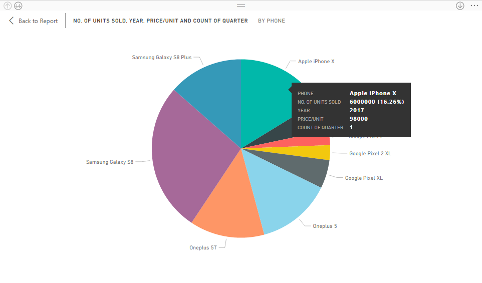
- Pie Chart
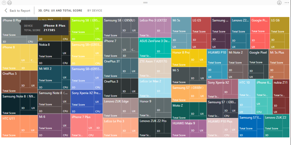
- Treemap
- Table
- Funnel
- Gauge
- Multi-Row Card
- Card
- KPI
- Slicer
- Doughnut Chart
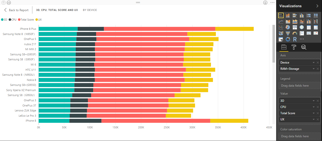
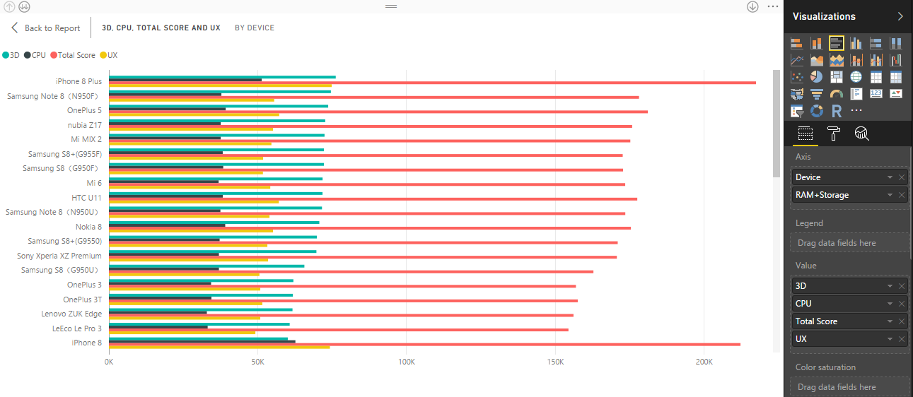
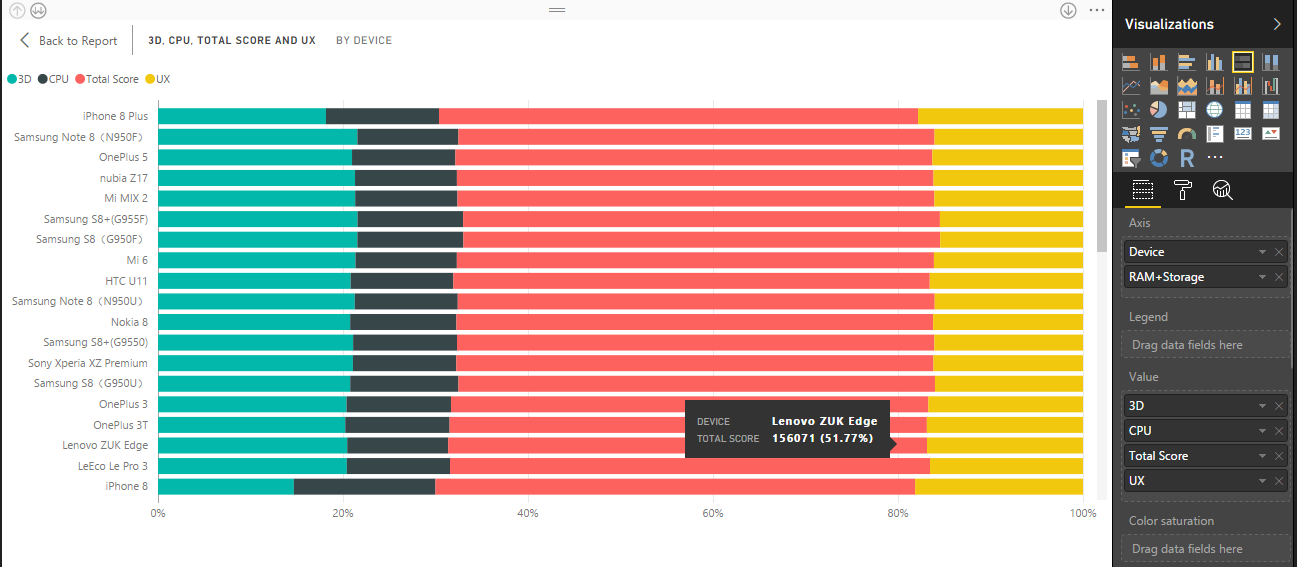
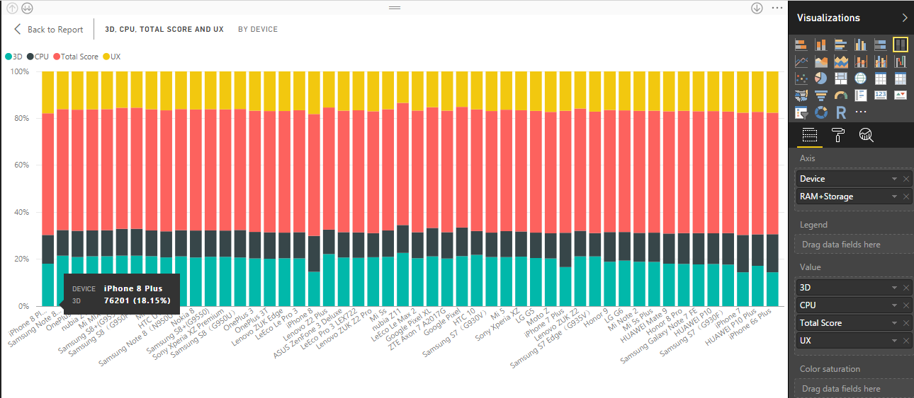
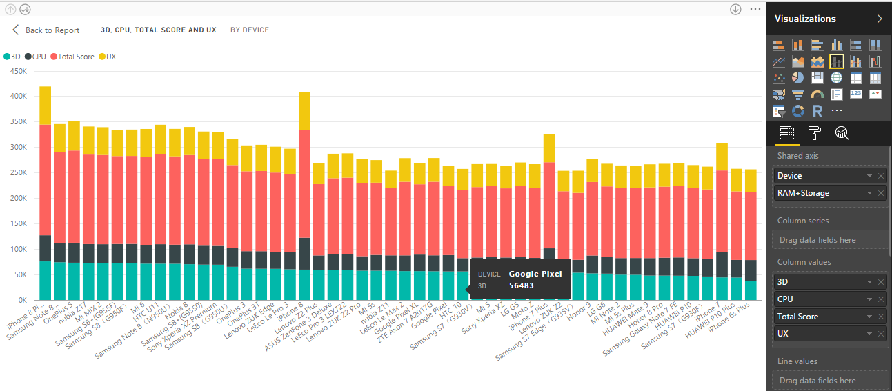
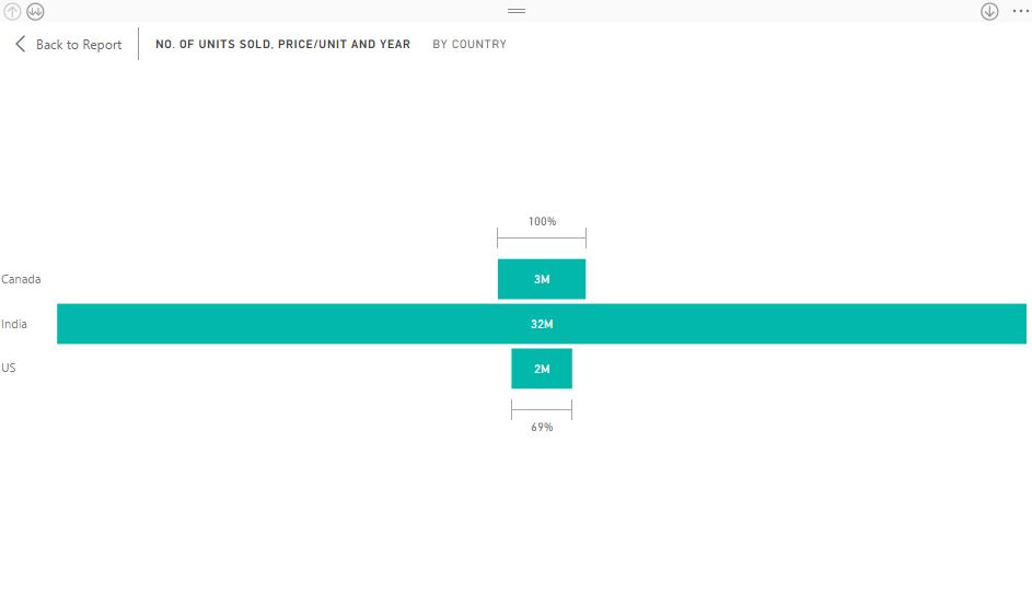
Stacked Bar and Column Chart
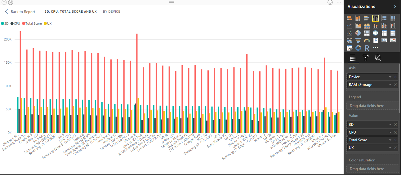
Bar charts are the standard for viewing at a precise value across various categories.
I have taken the value of the benchmark in the x-axis and the device name in the y-axis. To do this, you just need to drag and drop the ‘Device’ field into the Axis Pane. The fields with benchmark values like ‘3D’, ‘CPU’, ‘Total Score’ and ‘UX’, drag these into the Value Pane. Refer the image below for the result.
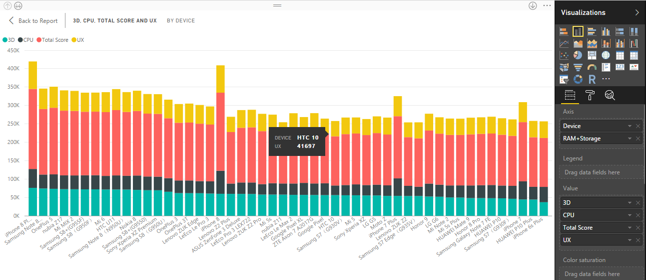
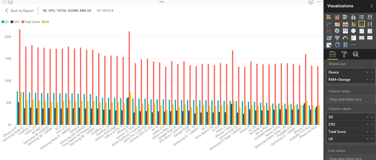
Clustered Bar and Column Chart
A clustered bar and column chart presents more than one data set in clustered vertical and horizontal columns respectively. Each data set shares the identical axis labels, so horizontal and vertical bars are classified by category.
Refer the image below for illustration.
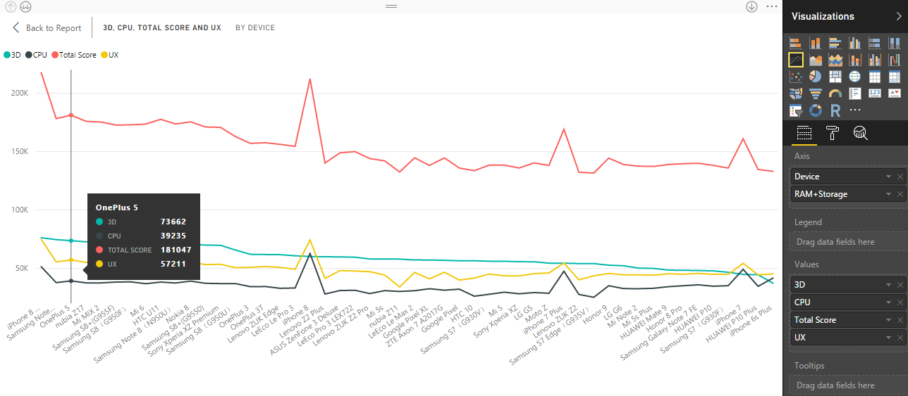
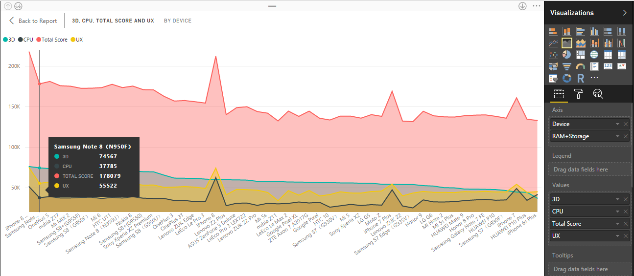
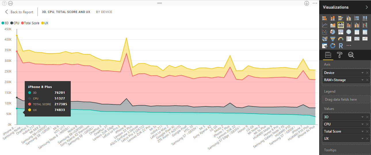
Line Chart and Area Chart
Line chart highlights the overall aspect of a whole range of values, normally over time.
A line chart or line graph is a kind of chart which presents data as a sequence of information points called ‘markers’ joined by continuous line segments. It is a fundamental type of chart standard in many domains. For example, to represent the profit and loss of a company over time. The x-axis represents the timeline and the y-axis represents the value. Value can be product sales, company turnover etc.
In our case, the x-axis represents the device and the y-axis represents the benchmark. The legend is as follows,
Red – Total Score | Green – 3D | Grey – CPU | Yellow – UX
In the Area chart, the area between the line and axis is filled in. The Area chart is based on the line chart.
The layered area chart or basic area chart is based on the line chart. The area between line and axis is filled with colours. These colours represent the volume.
Area charts highlight the degree of variation over time and can be used to draw attention to the total value of a course. For example, data that represents a gain over time can be plotted in an area chart to highlight the total gain.
Instances when to use a basic area chart
Basic area charts are an excellent pick:
- to view and analyze the volume trend over time
- for singular set defining a physically countable set.
Refer the screengrab below for illustration.
Line and Stacked or Line and Clustered (Combo Chart)
A combo chart fuses a column chart and a line chart together. Select from
- Line and Stacked Column
- Line and Clustered Column.
Instances when to use a Combo Chart
Combo charts are an excellent pick:
- When x-axis of column chart and line chart are same
- When you have to analyze multiple measures with varying values
- When you have to illustrate the relationship between two patterns of a single visualization
- When the canvas space is to be conserved.
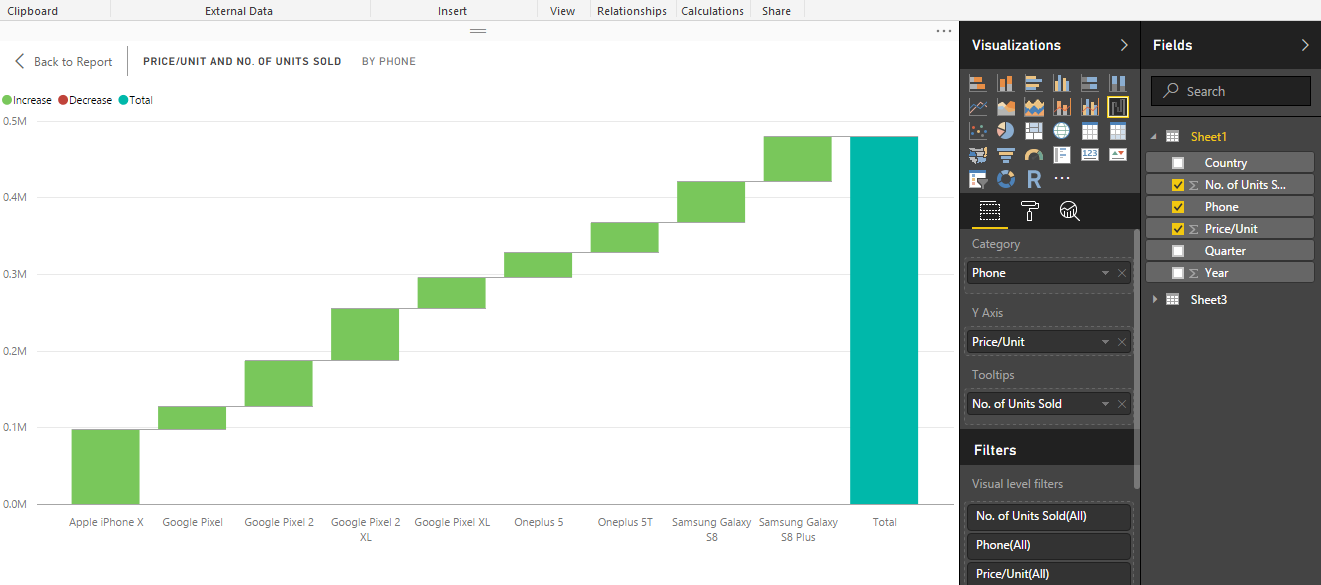
Waterfall Chart
Waterfall charts show a determining total as values are summed or subtracted.
It’s helpful for analyzing how an initial value (for example, net profit) is influenced by a range of +ve and -ve changes.
The columns are color-coded so you can instantly recognize rises and falls. The first and the last value columns usually begin on the horizontal axis, while the in-between values are hovering columns. Because of this formation waterfall charts are also called bridge charts.
Instances when to use a waterfall chart
Waterfall charts are an excellent pick:
- to review the significant changes contributing to the cumulative value
- to plot your company’s quarterly profit-loss by displaying various sources of income and arrive at the cumulative profit (or loss).
- to represent the start and the ending headcount for your company in a year
- to visualize the amount of money you earn and spend each month, and the working balance for your account.
For example, represent the number of smartphone units sold in the year 2017. The x-axis represents the ‘Phone’ and the y-axis represents the ‘No. of Units Sold’
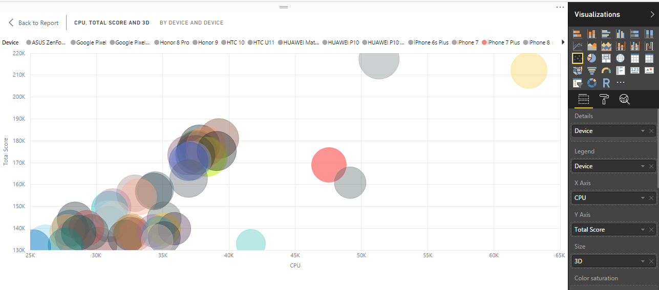
Scatter and Bubble Charts
Show relationships between two (scatter) or three (bubble) quantitative measures
A scatter chart always has two value axes to show one set of numerical data along a horizontal axis and another set of numerical values along a vertical axis. The chart draws points at the intersection of an x and y num value, fusing these values into singular information points. These information points may be scattered uniformly or non-uniformly across the horizontal axis, depending on the data.
A bubble chart replaces the information points with bubbles, with the bubble size rendering an extra dimension of the data.
For example, in which order, whether or not, etc.
Instances when to use a scatter chart or bubble chart
Scatter charts are an excellent pick:
- to show relationships between two (scatter) or three (bubble) quantitative measures i.e. num values
- if you want to plot two sequences of numbers as one group of X-Y coordinates.
- alternatively to a line chart when you want to adjust the scale of the horizontal axis
- to convert the horizontal axis into a logarithmic scale.
- When the worksheet data is to be displayed which includes pairs or grouped sets of values.
- to analyze huge numbers of information points without time consideration. More the data, better the comparisons.
Bubble charts are an excellent pick:
- if your data has three information groups that each hold a set of values.
- to use with quadrants.
- to display financial data. Various bubble sizes are used to visually highlight particular values.
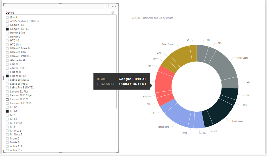
Slicer and Doughnut Chart
A slicer narrows the part of the dataset displayed in the other visualizations on the page.
Slicers act as an alternate filter. Here I have sliced the doughnut chart representing more than one smartphone’s benchmarks. As per my selection of the smartphone from the Slicer, the doughnut chart exhibits variable visualization. The Smartphones selected are Google Pixel XL, iPhone 8 Plus, LG G6, Samsung Galaxy S8. Please refer the screenshot below for illustration.
Other Power BI Visualizations
Some of the other popular Power BI Data Visualizations are Pie Chart, Treemap, Table, Funnel, Gauge, Multi-Row Card, Card, KPIs, Map, Matrix. You can provide the feedback in the comment section of this post if you want these to be explained too in my future posts. I don’t mind doing a Part-2.
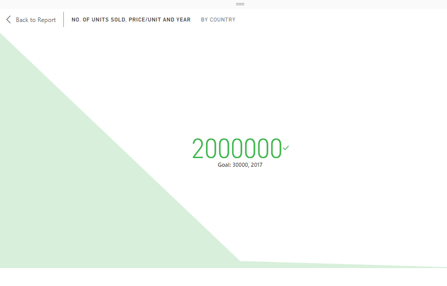
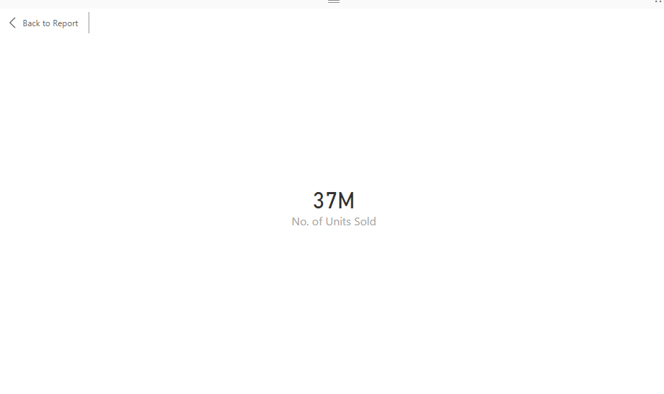
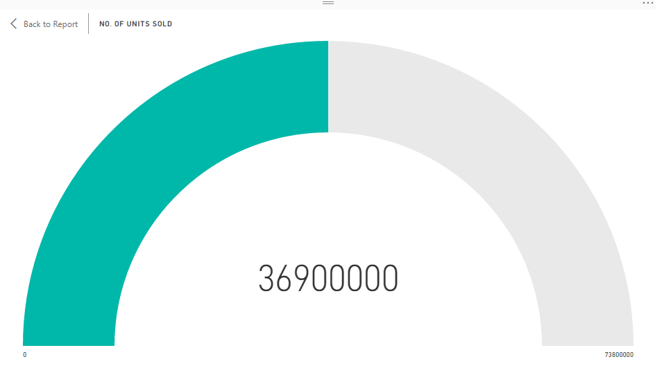
Some more Screenshots to give you an idea about these other visualizations. They are pretty straightforward and you can experiment with them with different datasets and post the feedback in the comment section.
Conclusion
Microsoft keeps on adding new visualizations and providing new features to old ones bundled with the latest updates to Microsoft Power BI. When a new update is released, I will likely be doing a followup post regarding the new features and visualizations. So stay subscribed and follow twitter handle @MyDigitalVidya. You can read about what’s new in the latest February 2018 update here -> https://goo.gl/i6k5NG
[Database Credits: Excel database compiled from data downloaded from Antutu benchmarks official website.]
[Please Note: The values for ‘number of smartphone units sold’ is an approximation for illustration purposes and does not represent the company’s official numbers]