
This blog post will concentrate on creating beautiful and powerful reports using Microsoft Power BI Reporting tools. I will also share some tips and tricks you can follow while creating reports.
Simple Report
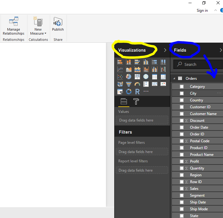
So, when you start I gonna assume you have got some data, there is a get data button on the top that allows you to connect to the server or local storage. After you pull the data you will see the set of data or fields you have pulled in. In the middle you have got a nice blank canvas, and this is the place where you can start building visualizations, doing your analysis, and you are given this visualization pane which gives you access to the gallery of visuals that it provides like box, custom visuals about which I will talk in a bit more later down the post.
Below it, you can control the look of the visuals of your page. and building things is very simple, you find the fields you are interested in and drag them into the canvas, and it will start creating stuff for you, so if you place like something a measure like sales amount, it will give you a chart, so if I want to slice it by style of car, for example, we will get a little visualization showing that we have been selling lots of Diesel Cars, and lots of Sports Cars, very simple!
Visual Interaction
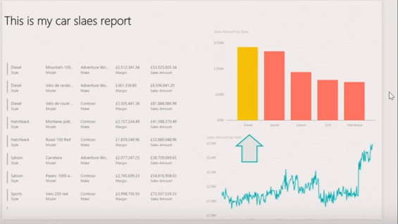
Let’s try some other ones. Let’s take the sales amount again and slice it using time and let us turn it into a line chart. so converting between different visualization is pretty simple, you just select the one you want from the visualization pane and then finally add something new, type of product, model, make, sales margin etc. and here is my report in just ten to twelve clicks. The report is showing a really simple visualization that shows me some of the details of the products we have sold. The great thing about these visualizations is that they are all instantly interactive, I don’t have to do anything else, I can just click on these things and assuming data will come from the same place, things get cross filtered, highlighted, the spike adjusts as per the choice of the bar we select.
The other thing I can do here is start formatting and changing the way this report looks like adding titles is really easy and I can just choose to insert a text box. I can also do drawing like shapes and lines like if I want to put an arrow in to highlight a particular time period. I’ve got a bunch of controls that I can just start to embellish and add things to my report and of course I can go and start changing the format of these charts and visuals as well. so this visualization pane also contains under this formatting tab, all of the different options that you can find here to control whether or not we are showing the axis, what those axes look like, do we have a title for it, things like the color for the data. Power BI provides all these formattings to give you more beautiful reports.
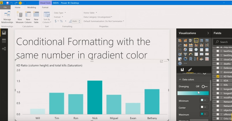
Conditional formatting with the same number of gradient color
You can change the colour of your graph dynamically based on the value in your data. Let’s take a sample data from various gamers who play the game Halo or Destiny. So after pulling the data, we have got various fields of data like ‘number_of_kills’, ‘number_of_times_died’, ‘headshots’, etc.
Drag and drop the fields – ‘number_of_kills’ and ‘gamer_name’ on the canvas then select the bar chart from the visualization pane. We can see the name of the gamer and their respective kills represented by bars. The higher the bar the higher the kills.
To make BI Reporting powerful we can create conditional formatting by setting the gradient colour in the formatting tab. By doing this the intensity of the bar colour will change as per the number of kills, more he kills the stronger the colour. Lesser the kills, lower the colour intensity.
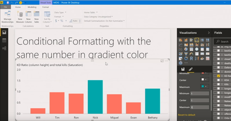
Now if we want a different colour to represent a different state, we have a workaround. We select the ‘max’ colour and ‘min’ colour and the gradient will be created by the in-between shades. We can set the value ‘1’ for each ‘max’, ‘medium’ and ‘min’, and select the ‘max’ colour as green and ‘min’ colour as red. So by doing this, you can see the gamer who has performed maximum kills, his bar will be highlighted as green and the gamer whose kills are the minimum will be represented by a red bar. Microsoft is still working on this feature and making it more user-friendly. You can send the feedback on this feature. More the feedback a feature receives, the more they concentrate on implementing and making that feature better.
Alignment
To make the reports neat we can multi-select all the visualization, go to the Format tab at the top. Click on align and select the desired alignment to make everything line up. A simple feature but a great time saver and making our reports beautiful. So no more OCD regarding lining up the charts. 🙂
Power BI and Excel
Use Microsoft Excel and Power BI together and build powerful, consistent reports and visuals.
Introduction
Possibilities are abundant that you’ve used Excel before. Perhaps you used Excel to build or see reports or to create pie charts or other visuals. Or perhaps you used Power Pivot or Power Query to generate solutions that were a bit more complex. If so, you’ll be right in sync with Power BI, and so will your workbooks.
This part shows you just how easy it is to get Excel workbooks into Power BI, and illustrates that Power BI and Excel make a great combination.
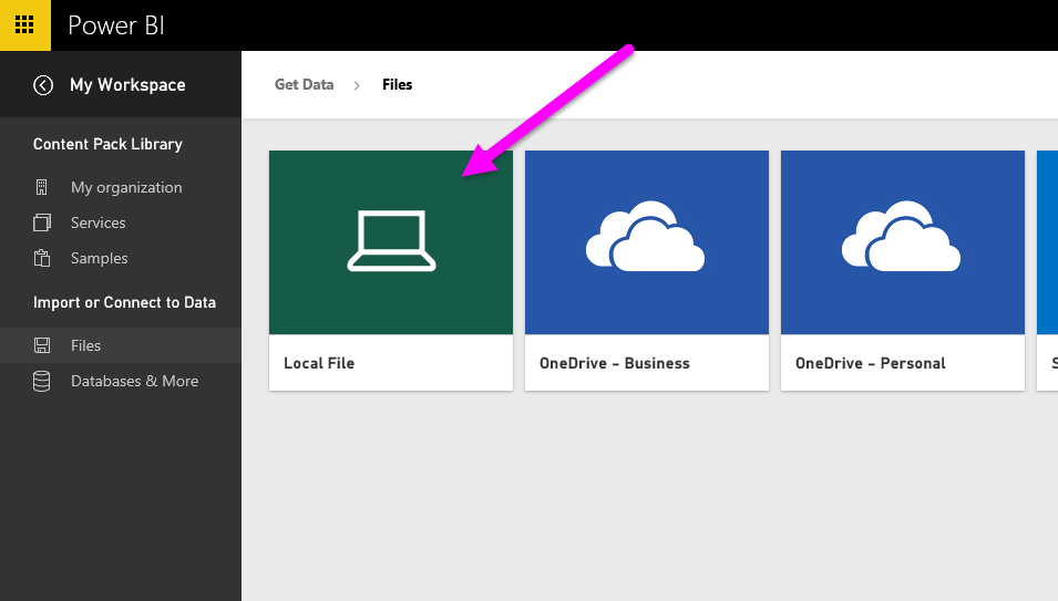
Get Excel data into Power BI
In this section, we’ll first take a look at how you can send an Excel workbook file containing a simple table from local storage into Power BI. You’ll then learn how you can begin viewing that table’s data in Power BI by building a report.
Data should be formatted as Table
In order for Power BI to get data from your workbook, that data needs to be formatted as a table. It’s simple. In Excel, you can highlight a range of cells, then go to the Insert tab of the Excel ribbon, then click Table.
Your files do not need to be on a local storage, of course. If you have uploaded your files to OneDrive, Google Drive, Box, or any other cloud storage, that’s even better. OneDrive being the best option since it is from Microsoft and thus provides the best integration.
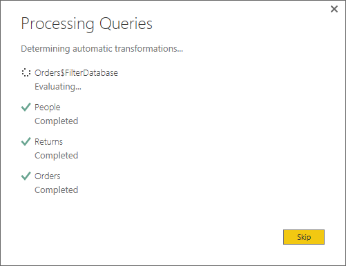
After importing data into Power BI, you can begin building reports.
Start BI Reporting
Once data from your workbook has been imported, a dataset with fields is created in Power BI. It appears under Datasets. Now you can begin analyzing your data by building reports and dashboards. Click on the ‘Open menu’ option next to the dataset and then choose ‘Explore’. A new blank canvas appears. Over on the right, under Fields, you’ll be able to see your tables and columns. Just select or drag and drop the fields whom you want to participate in the visualization process on the canvas.
You can change the style of visualization and apply filters and other properties under Visualizations pane.
Conclusion
BI Reporting is very great, those simple interactions, that cross highlighting and filtering I think are one of the real highlights of Power BI reports. and one of the way you can make powerful reports. It makes it really easy to start telling a story of those reports and highlighting some of the key insights you find in your data.
[excerpt credits: Video presentation titled “Creating Impactful Reports using Power BI” by Will Thompson; Program Manager at Microsoft.]