Introduction to Conditional Formatting
When someone refers to the Formatting of a cell it means they are referring to the colors, fonts, borders, alignment, etc. of the cell. When a conditional format is applied on a cell it means the formatting of the cell is based on a condition. Why would you need this? Let’s say you have a huge dataset and you want to format it with appropriate colors for each column. Within each column, again there are variations in color depending on the values. Now, whenever some data changes, or new data is added, you will have to manually change all of this. This is where you can use Conditional Formatting. It will automate the formatting for you. Conditional Formatting Excel 2010, Conditional Formatting Excel 2013, Conditional Formatting Excel 2016, are all the same.
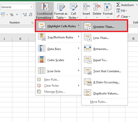
As the name suggests, you can set up conditions based on which Excel will know what formatting to apply for different values. Let’s try a very simple conditional format. Click on a cell and go the Home Tab > Conditional Formatting. Then select the first option, Highlight Cell Rules > Greater Than. In the next dialogue box, put a number, like 100 and press OK.
Now, if you put a number below 100, nothing will happen. But as soon as you put a number that is greater than 100, the cell will turn red. Again, if you change the number to one which is less than or equal to 100, the color disappears.


This is basically how Conditional Formatting works. This can be applied to multiple cells as well. You can even select a full row/column and apply this.
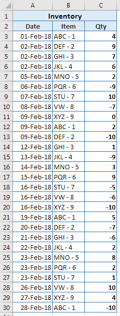
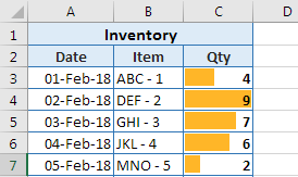
To see all the tips in action, we will use a simple inventory list as an example. It consists of 3 columns – Date, Item, and Quantity received or removed.
Highlight Duplicate Values
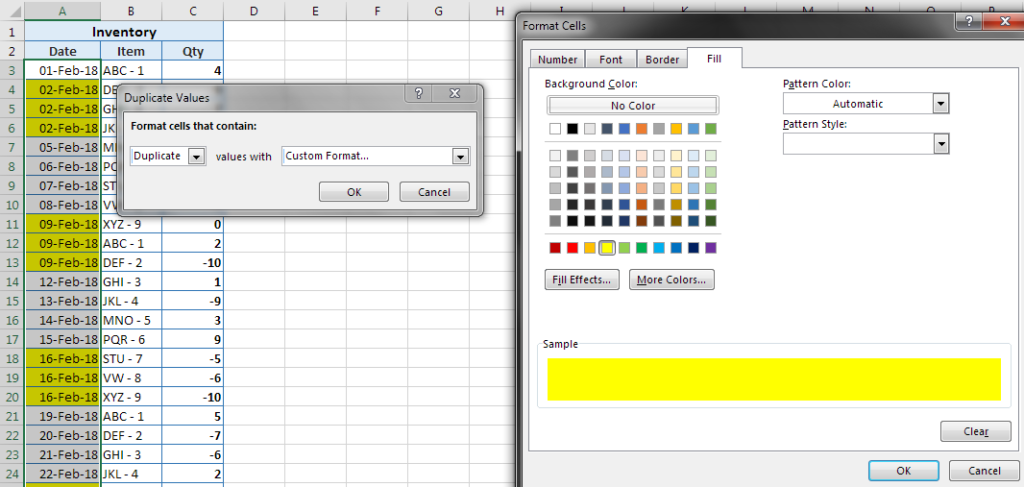
Before we start with the tips, just to get familiar, let’s look at a couple of options in the highlight cells menu like Duplicate Values. Using this will simply highlight all the duplicate values in the selected range. When selected, in the first set of options, we can choose to highlight duplicate or unique values. Going to the custom format option will open up more formatting options. Applying this to the date column will format all the dates that repeat. This will help us see all the dates on which multiple transactions have taken place.
Highlighting Dates
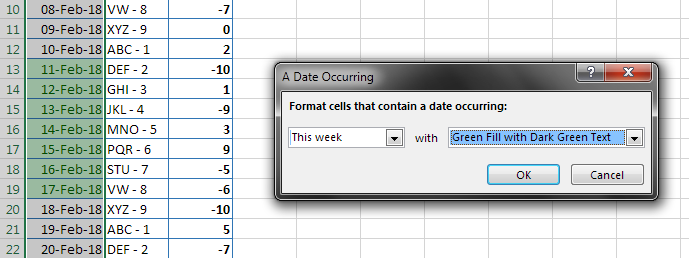
Apart from simple rules like greater than and duplicates, there are others like “A Date Occurring…”. This condition is based on dates. Many conditions will have sub-conditions. This is one such example. Here, we will select all the dates and apply the conditional format. Within this dialogue box, there are many date – related options available. We will use ‘This Week’ as we want to highlight all the dates that fall in the current week. Likewise, you can use any other setting, as needed.
Removing & Deleting
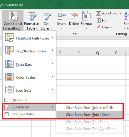
Another important thing to know with conditional formats is if you delete the contents of the cell, the conditional formatting will not go away. To remove conditional formatting, you will have to open its menu and navigate to Clear Rules and use a suitable option.
Also, did you notice the option reads Clear RuleS. Yes, that means, you can have multiple conditional formats applied to cells.
5 Great Tips on Conditional Formatting
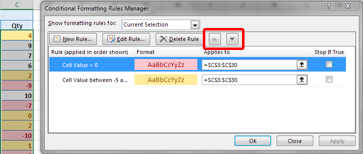
Tip #1 -Multiple Conditional Formats
Let’s apply 2 rules on the quantity column. First to highlight all items between -5 and 5 in yellow. The second to highlight all items below zero in red:
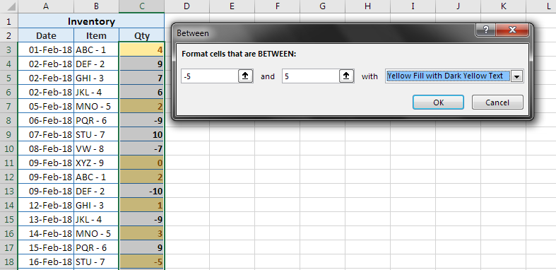
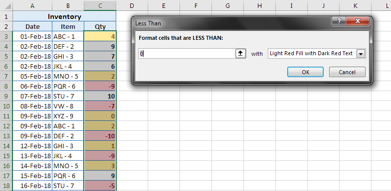
If you see the 18th row in the 2 screenshots above, you will see the quantity of -5 falls under the first rule used. It falls between -5 and 5. But as soon as the second rule is applied, its color changes to red as it also falls under the less than zero rule. This means that the last rule you apply has preference over the previous one. Nevertheless, by going to the ‘Manage Rules…’ option at the end of the Conditional Formatting menu, you can control the order. This will get you a list of all the conditional formatting applied to whatever cell(s) were selected. Just use the up / down arrows to change the order. Here the top-most rule will have most preference.
Tip #2 – Data Bars
To make reading large amounts of data, we can use options like Data Bars. There are many color options availabe in this menu. Any of these can be used to get the same result. If we apply this on a range of values, it will color each cell in proportion to the other values. For example, if I use it on the first few values in the quantity column, it will look like this:
The amount of color a cell has depends on the maximum and minimum values of the selected range. The cell with the maximum value will be fully colored. The cell with the minimum value will have minimum color. If a value of zero is present, the cell will have no color. All of this will keep adjusting within the range as the values change.
Now, in our example, the quantity column also has negative values. To see how the data bars look on them, the range we have applied the data bars to has to be edited. To do this, you can go to the Manage Rules option. Here, we can also edit the range the rule applies to.
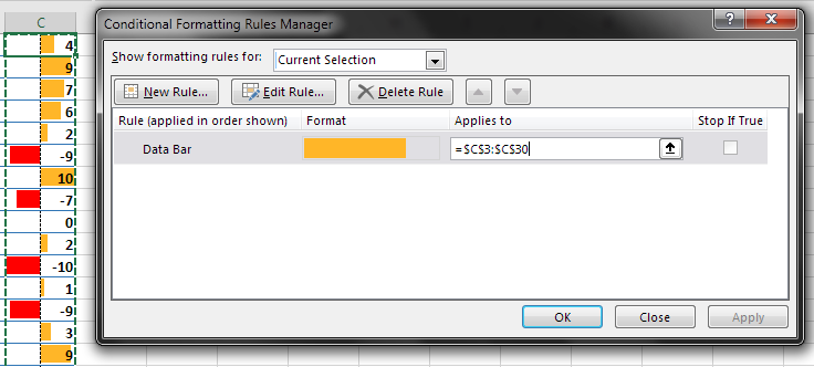
As you can see, the data bars have changed to indicate positive and negative values. The black dotted line down the middle represents the zero mark.
Tip #3 – Color Scales & Icon Sets
Another way of using colors based on values of cells is to create a ‘heat-map’ of sorts. This is done by using the Color Scales option. In this menu, the color choices matter.
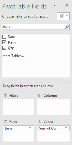
Conditional formatting can also be applied to pivot tables. To create a pivot table, select only the data, then go to the Insert tab on the ribbon and choose the 1st option. Then click ok or press enter to create it. Once the field list comes up to the right, select item and quantity by clicking the small checkboxes next to them. So, a simple pivot table is created to summarise the status of all inventory items.
Selecting just the values in this table, use the White – Red color scale. This will make all the negative values red while leaving the higher positive values white. This makes it very easy to read the data at a glance. This is a very short list, but with a huge range of numbers, it’s a much welcome support.
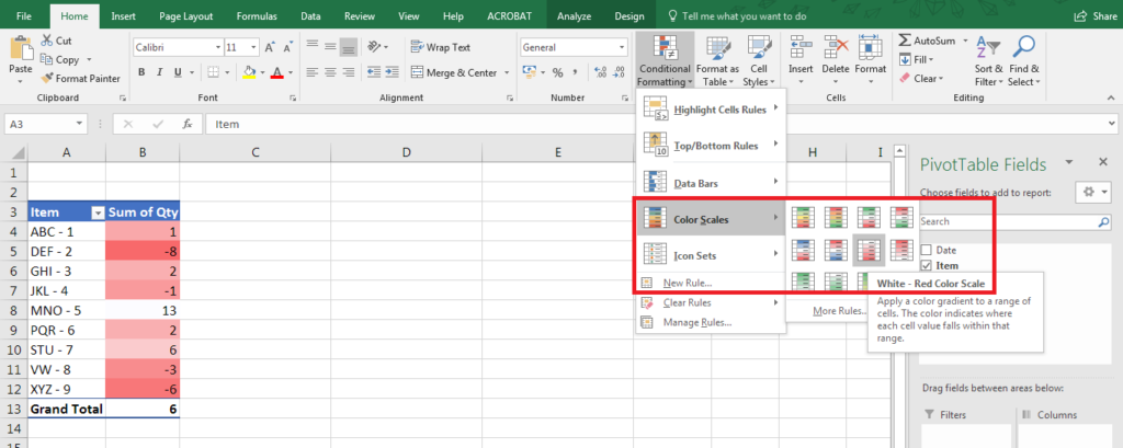
Now, these colors get a little confusing for people to choose from. To make it simple, the first color that is mentioned will be assigned to the highest value. So, if you choose the green – yellow – red scale, the highest values will be green. The lowest will be red and the middle values will get yellow.
Another way to graphically represent values is by using Icon Sets. Applying the 3 Symbols (Uncircled) icon set to the quantity column will look like this:
![]()
This shows the status of inventory for each item at a quick glance. If the item has a green tick it means there is enough. If there is a yellow exclamation mark, it’s time to refill. If it’s a red cross, it means that many items have not been returned at all.
Tip #4 – Highlight based on Dropdown
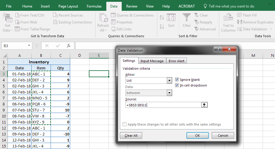
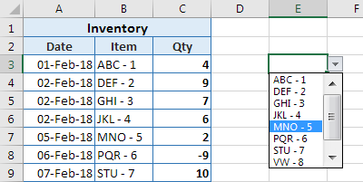
A dropdown is a simple list of items you can choose from. We will use this and link it to Conditional Formatting. This will let us select an item from the list to automatically highlight all instances in the whole dataset. To set up a quick list in cell E3, select it and go to the Data tab and choose data validation. Next in the ‘Allow:’ menu choose list and then click on the ‘Source:’ box and choose the first 10 items. In our data, it’s a unique list of all the item names in the entire column. Pressing ok will show there is a small drop-down arrow next to the cell. Clicking that will open the dropdown. Choose any item to input into the cell.
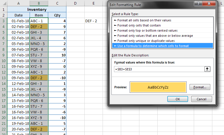
This is a part of analyzing data in Excel. In Excel conditional formatting formula can also be used. This means any Excel formula which results in True or False can be used. Just like the Excel function ‘=IF’; pretend this is the Excel conditional formatting formula IF. So, if the formula returns true, the cell(s) will be formatted. If the formula returns false, the cell(s) will not be formatted.
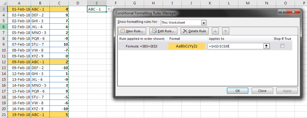
Let’s use a simple formula reference the drop-down list in cell E3. To use formulas, first select the Item column (without header) and go to the Conditional Formatting menu > ‘New Rule’ option. In the next dialogue box choose the last option ‘Use a formula to determine which cells to format’. Now, the dialogue box will have just 2 options. The first is the box where the formula goes and the second is a button to set the format or the cell(s) if the formula is true.
As with any other formula, we will start with an ‘=’. Now each cell must be matched individually to the value in E3. To specify that, click on the first item i.e. cell B3. This will show up as =$B$3. Normally, within formulas, dollar signs signify that the row and/or column is fixed. Within Conditional Formatting, they signify what is to be checked. Because both the B and the 3 have a dollar sign before them, if the formula is true, only the cell B3 will be checked. In this example, each row needs to be checked. Only if there is a match, formatting should be applied to that row.
To fix this, simply delete the dollar sign before the 3 to make the formula =$B3. This will allow the formatting to happen for each row. Next, to make it check with the dropdown, put another ‘=’ and click on E3. The Conditional Formatting formula now becomes =$B3=$E$3. Next, just select some formatting to be applied using the format button. Press ok and test out the drop-down list.
Tip #5 – Highlight Entire Rows
Using the previous example, if we just edit the Conditional Formatting rule to apply to the entire dataset, it will extend and highlight entire rows. To this, go into the manage rules section, and change the ‘Applies to’ section to include the entire dataset.
Changing dropdown values will now highlight entire rows instead of one column at a time.
Wind-up of Conditional Formatting
Conditional formatting thus allows you to visually analyze your data, based on a large number of condition types,
- Greater than, Less than, Between
- Above / Below Average
- Top / Bottom 10
- Top / Bottom 10%
- Duplicates / Uniques
- Dates – Dynamic or a fix date range
- Text containing
Apart from these in-built ones, you can create ‘n’ number of conditions using the ‘Use a formula’ option as explained in 1 example above.
Try to use IF, AND, OR, LEFT, RIGHT kind of functions within the ‘Use a formula’ option and create your own conditions.
Conclusion
Advances in technology have helped data science grow from cleaning data sets and applying statistical methods to an area that includes data analysis, predictive analysis, data mining, business intelligence, machine learning, deep learning, etc. To build a career in Data Science and become a Data Scientist, read this Quora Answer.
Data Analysis may be a broad concept, a list of skills, if acquired, will make you excel in the field. Learning them is now easy with a full set of this Data Analytics Using Excel Course.