
We are dependent on our cell phones. For most of the individuals nowadays, their Smartphones are the primary thing they look at when they wake up in the morning and also the last thing they look at before they go to sleep in the nights. We all use our phones for everything and they have significantly changed our lives. Mobile phones have changed the way we utilize the web and, subsequently, it has changed the SEO. Now, Mobile SEO causes businesses to target clients on the go.
What does it mean to Optimize Site for Mobile?
Mobile SEO is similar to the regular SEO that lets your site become Crawlable and findable in the search engines. Likewise, it ensures stellar execution, extraordinary content and a perfect UX. To hit the nail on the head, you have to know how your site is presently performing on the mobile devices and what your site visitors are doing at this point on their Smartphones. Mobile SEO that optimizes presence of your site or e-business on Mobile Phones quite effectively ensures all this.
A site is considered Mobile Friendly when
- The site presents content well on a phone that does not need pinching/zooming.
- The site is easily readable on small screens and is also easy to navigate with a finger.
- The site is helpful to someone using a phone and is also understood properly by Google.
When you let your site be mobile-friendly and understandable to Google then Google ranks your site more appropriately. Below given steps will help you do this emphatically-
Developing your mobile site- Responsive Design vs. Dynamic Serving vs. Separate Domain
At the time when you develop your mobile site, three options available to you are-
- Responsive design
- Dynamic serving
- Separate site on a subdomain

Responsive Design
Amongst overstated three, Google enjoys responsive design more as via this; you will have a site that easily and accurately adapts to the device it is used on. In this, there would be only one code base that ensures easy maintenance. Google says that using responsive design will let your site be eligible for addition in the new mobile-first index. You can let Google know that your site is mobile friendly via the addition of the Meta name=“viewport” declaration in the head of your documents.
<meta name=”viewport” content=”width=device-width, initial-scale=1.0″>
Dynamic Serving
Dynamic serving utilizes server-side technology for serving a different version of your site to mobile users that depend on the way a user accesses your site. In this, the URL will stay the same but the files that are sent would be completely different. For this kind of site development, you are required to add the Vary header to get Google crawl your site, as this will let Google know that it will find out the mobile-optimized files from somewhere else. A Vary header would appear like this when a browser will make a request:
Vary: User-Agent
Separate Domain
The third option for you when you opt to go with Mobile friendly development is a separate mobile site on a different URL. Google will support this method, but for this, you would need to make the correct connections in between your regular desktop domain and the mobile domain. You are required to use rel=”alternate” and rel=”canonical” for letting Google know how these pages are connected.
Role of AMP & PWA
AMP or Accelerated Mobile Pages
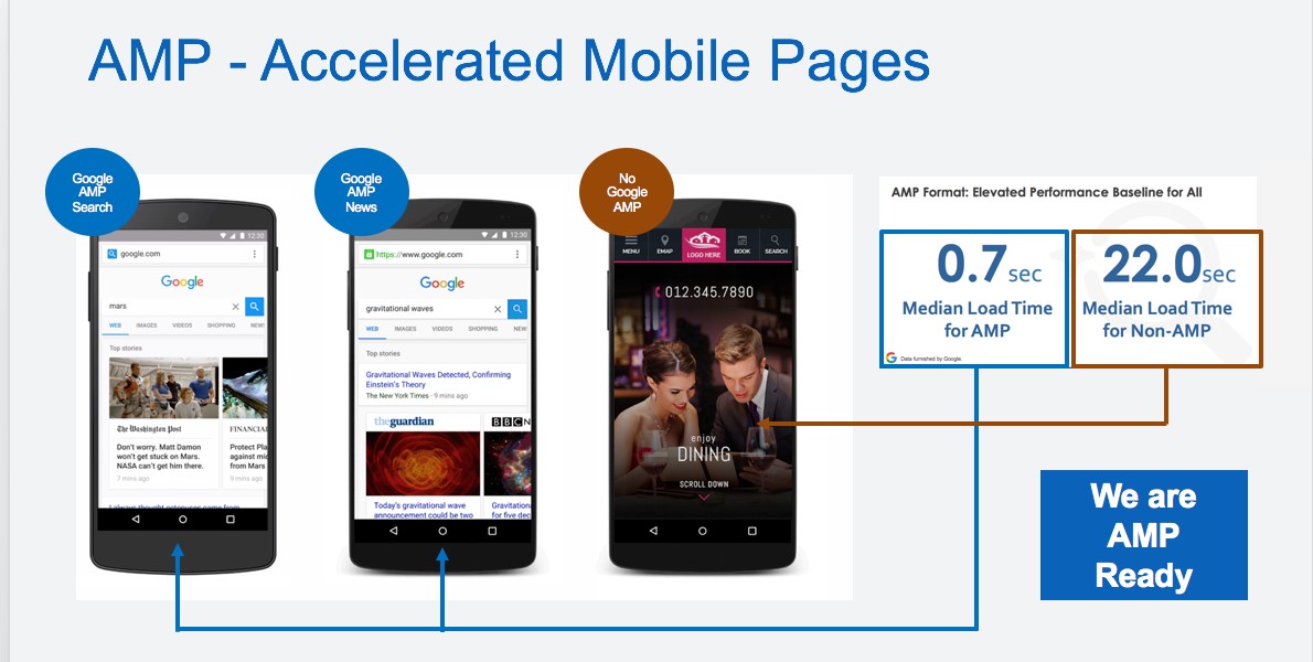
- AMP is a Google-led open source project that lets your pages load as fast as possible.
- Google is pushing this technology so hard and it is greatly significant for ensuring Google Mobile SEO of your site.
- AMP now empowers static posts such as blogs or news articles, canonical sites, and so on.
PWA or Progressive Web Apps
- PWA works on all devices, for all users and acts as a crossover in between the app world and the web world.
- Via PWA, the web app will work like an app and it will also be not required to publish it in an app store.
- PWAs include the load speeds of mobile sites with the best functionality of a native app that can cajole users that they are using a native app.
- Read Google Blog on how to create Indexable PWAs to comprehend the use of Progressive Web Apps as Mobile SEO techniques.
Make Sure Better User Experience for Mobile Users
Along with being easily found and having lightning fast speed, ensuring enjoyable user experience for your site visitors is also an important part of Mobile SEO optimization. Some of the important things that act as Mobile SEO check for ensuring better User-experience for Mobile Users are-
- You should never forget your customer and should always make your mobile site useful and enjoyable.
- You should fix your font size and your typography needs to be top notch.
- It is important to maintain enough room between the clickable elements.
- You should also make your sub-menu clickable because this will let users use submenu predominantly instead of going to home pages.
- It would be beneficial for you to put your phone number on the homepage and make it clickable because this will let people call you if they want to do business with you.
- You should not make users pinch and zoom to see and use your mobile site interfaces.
- You should also make your buttons large enough for fingers and it would be significant for you to fix your forms because bad forms are unusable on mobile.
- You should cut the clutter from your site and then test, adjust and test again to ensure your Mobile SEO be result driven.
Do the Local SEO for Mobile
According to Google, around 76% of people who search for something nearby on Google prefer visiting the related business within a day and around 30% of those visits convert into sales. All this makes local SEO be one of the most important factors of Mobile SEO. Below given are some tips to improve local SEO for mobile-
- You should write locally oriented content and build local links.
- You need to use Google My Business by signing up and filling in your details. You should keep your NAP data up to date and responding to reviews and uploading photos would also be a plus for you.
- You should Ask your customers for reviews and then you need to mark them up with structured data and present them on a particular page on your site as this may do the wonders for your business.
- It would also be beneficial for local Mobile to take beautiful pictures of your business and add them to Google My Business.
- You should pay heed upon using Schema.org, as this will let you add structured data for NAP details, products, reviews, etc. that will help you get mobile rich search results such as rich cards or carousels
- You need to ensure that your contact information is always correct and up to date.
- Including Yoast Local SEO for WordPress plugin: can do a lot of the hard local mobile SEO work for your site.
Know the right Kind of Mobile Content
Smartphone screens are small and for doing effective mobile SEO, you also need to know the right kind of mobile content. If you do not pay attention to this, your site text may get truncated and wrapped in a seemingly never-ending stream of paragraphs and that is why it is said that text on a mobile screen can give any web designer a headache. You need to fix typography of your content to make them mobile friendly. Some tips related to this are-
- Users read a lot on their smartphones and you should make it as easy as possible for them to do so
- You should make sure that your content is up to scratch
- You should write for the small screen
- It is also important to write better meta descriptions and titles
- You should also prepare for voice search with your mobile site
Understand What Google Mobile-first Index Is
Google now determines rankings of sites based on the quality of the mobile version of the site instead of the desktop version. Your mobile site will now be crawled by a new Googlebot that will determine if the performance, content and user experience of your mobile site are up to scratch. If your site fulfills all this then it would let you get a better ranking. Mobile first index fulfills all such requirements. It will ensure the same awesome content on both the mobile and desktop site along with immaculate inclusions of structured data, correct metadata, hreflang links, etc.
According to Google’s Maile Ohye–
“To “optimize” for a mobile-first index, make sure that what you serve to mobile users is the version of the content you’d want Google to index, not a pared down version, or a version that gets updated later than desktop, or a version that redirects to the mobile homepage.”
Know the Mobile SEO tools
Knowing Mobile app SEO tools would ensure better mobile friendliness for your site. Different search tools of Google Search Console would help you in this quite efficiently. Different tools inside this console that would help you in Mobile SEO are-
Search Analytics
This will help you see how mobile and desktop users use words to find what they need. With the help of this, you can know if you are targeting the right words or you should focus on something else.
Fetch as Google
This one will let you comprehend how Googlebot sees and uses your content. Googlebot crawls the JavaScript, CSS and image files of your site and Fetch as Google will help you understand the process. You will see an error when the two screens do not align.
Mobile Usability
This one will check your site and present an overview of posts and pages that are not following Google’s mobile-friendly rules. This is considered an excellent Mobile SEO Tools for improving your mobile SEO.
PageSpeed Insights
This one will show you exactly how fast your site loads on both mobile and desktop and you can use it this alongside the Developer Tools in browsers for seeing how your site is rendering its contents.
Know the Smart Ways to Improve your Site Speed
You can follow different mobile SEO techniques for improving your site speed and some of them are given below-
- You should optimize images and use fewer images
- You should invest in quality hosting
- You should update PHP version to PHP7
- You should keep your redirects in check
- You should fix render blocking content above the fold
- You should prioritize visible content
- You should optimize and minify CSS, HTML, and JavaScript
- You should cache your assets
- You should use a CDN
- You should make the transition to HTTP/2
- You should upgrade to HTTPS
- You should load fewer assets like JavaScript libraries
- You should load fewer ad servers
- You should improve server response time
In Conclusion…
On the concluding note, I hope this mobile SEO guide would have helped you get many pointers to improve the performance of your mobile site.
Joining Mobile Marketing Course would help you master Mobile SEO skills, related technologies and tools to optimize your site on all kinds of mobile devices and let your business reach into the palms and pockets of your prospects.
Want to know how mobile-friendly SEO would work for your site; share your site & business details in comments below.


I have read many articles on mobile SEO but this article is one of the best-detailed articles on Mobile Seo. Once again Thank u So Much