Dear beautiful readers, it has been a while since I last blogged. To make it up to you, I would like to present something very powerful. Please welcome Power BI Service. We will cover Power BI Desktop but from a Power BI Service perspective. It also means we won’t get advanced features for free and be ready to invest in this amazing service. Let’s just say Microsoft has made Power BI Desktop a pathway to get you hooked on to the real stuff.
Introduction to Power BI Service
Power BI is a cloud-based business analytics service that allows us to conceive and interpret data with a higher rate, performance, and intelligence. It relates people to a vast variety of data via easy-to-use dashboards, powerful reports, and beautiful visualizations that bring our data to life.
So there are a few significant concepts to understand when you’re using a Power BI service and the significant things are workspaces, dashboards, reports, and datasets.
Workspaces
Workspaces are a kind of a container that can have many different dashboards inside them. The one that you’re most likely to use is my workspace which is kind of your own personal area to hold your information.
Dashboards, Reports and Datasets
Within those workspaces you’ll have a number of dashboards, you’ll have a number of reports and a number of datasets. A dashboard can have several tiles in it that are extracted from various different reports yet each report is attributed to one dataset and one dataset only. We can see how those dashboards are made up of visuals from particular reports and how those reports pull data from particular datasets.
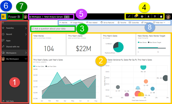
Let’s have a look at some examples of how that works. I’m logged into Power BI and I’m just looking at one dashboard in my workspace so like I said this is kind of a scratchpad area (please refer to the screenshot) where I can put all of my personal content and I can share things with other people from here but typically this is an area where you’ll just work with stuff that was just for you.
The dashboard that I’ve created has got a number of different tiles on it, I’ve got a title, I’ve got some bar charts, a donut chart and a map as well. So like I said any of these tiles can be pinned from this dashboard from multiple different reports. So for example, the bar chart came from one report, the donut came from a different report and the map came from a third report. The thing is when you pin visuals from reports on to dashboards, it retains that link, so whenever I click on one of these charts or these visuals it will take me back to that underlying report.
To get started with Power BI you need to upload datasets or connect to datasets in a particular workspace. Build reports on top of those datasets and then you can build dashboards that pull content from all of those different reports into one place.
Power BI Service Pricing
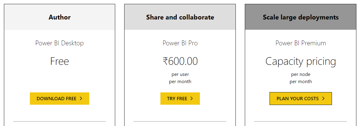
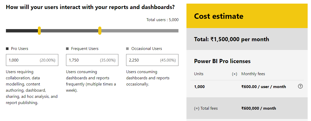
Power BI Desktop
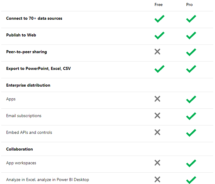
Microsoft Power BI Desktop is free which we have already explored in previous posts.
Power BI Pro
In Power BI Pro we can collaborate and share online, the subscription cost is just ₹600 INR per month. Power BI Pro is per user, per month basis.
Power BI Premium
Then there is also a customization option called Power BI Premium which enables us to model the subscription for scale large deployments as per a small group or a big organization. We can plan the cost which is reflected accordingly in real-time. This one is per node, per month basis.
Power BI Service and Power BI Desktop
Let’s start with an overview of the whole of the Power BI product set. We’ll start with Power BI desktop and connect us an Excel spreadsheet data, pull that in and build some visuals. Then I’ll show you how to publish that up to the Power BI service and build some dashboards from that. You can then use to track the data over time and share and collaborate with others around your organization.
When you open up Power BI desktop for the first time you’ll see the getting started screen and to begin all you need to do is hit get data over on the left-hand side. You’ll get a list of all of the data sources that Power BI supports but we’re just going to use excel for now.
I’m just going to choose a sample workbook when it connects you’ll see it’ll pull in a preview of all of the tables and tabs in that excel workbook. Now I could edit and transform this data as it gets loaded into Power BI but it’s in pretty good shape already so I’m just going to load it straight into Power BI desktop and you’ll see over on the right-hand side all of those columns from that.
Excel table get translated into fields within Power BI and now building visuals is as simple as dragging and dropping these onto the canvas so let’s take our for instance sales amount and drag that over, we get a little chart and let’s break that down by the different segments.
Now let’s publish it up to the Power BI service to track this and share it with others. So you can see in the ribbon I have the publish button. I’ll get prompted to save the file locally first.
If this is the first time you’ve done this you’ll get prompted to sign in to the Power BI service so pop in your email address you may need to authenticate here as well but you’ll get presented with this list and this will show you all of the workspaces in the Power BI service. My workspace is kind of your default scratchpad but then there are other workspaces that maybe you’re part of groups that have these workspaces that you could publish this into as well. I’m just going to select my workspace for now and now the reports published up to Power BI.
I can click the link open in Power BI to go straight to our report and open it in the browser. So I can see exactly the same visuals and get all the same interactivity in the browser itself – and I can now start doing things like pinning these visuals from this report on to dashboards that I could create and share with other people.
So to do that select the visual that you’re interested in and click the little pin button at the top, you’ll get a choice of whether you want to pin this to an existing dashboard or to a new one. Create a new one and pin that map as well. You’ll see you get a little notification telling you that that visual is pinned successfully.
When you go over to the dashboard it will take you to see those visuals on the dashboard. Now we could go to many different reports and pin all those visuals into one dashboard. The great thing about these dashboards is you can pull content together and pull visuals together from many different data sources into one place to keep track of all of that stuff that’s important to you, to your business.
So that’s a really simple example of how you can take data from excel, pull it into Power BI desktop, publish it up to the service and then use that to build dashboards that you can share and use to track your data around your organization.
Dashboards and Power BI Service
When you first log in to Power BI you’ll actually see a blank screen because you’ll need to create some content but once you’ve built a few dashboards, the dashboard is kind of the top-level concept within Power BI.
I’ve got data coming from multiple different places all being brought into a single dashboard and that’s one of the key things with Power BI it’s about being able to track all of the different data within your business, bring it into one place that you can help monitor that overtime to make better business decisions.
Like I said the dashboard is the kind of the top-level concept that you want to understand here. The navigation pane on the left-hand side shows you all of the dashboards that are available to you but then also the reports and datasets a single dashboard is made up of multiple tiles and all of these tiles will be linked by default to a particular report behind the scenes so when you click on one of these tiles, it’ll take you through to a report and you can see the navigation pane is highlighting the report.
You can see the same vision and a bunch of other visuals that will help you analyze and find insights into this data by clicking slicing and dicing that data. This report, in turn, was created from a particular data set and you can think of a dataset as either a pointer connection to another database or a set of data itself that might have been cached in the Power BI service and being refreshed automatically maybe on a daily basis.
The way these things that are linked together is that a dataset can be linked to multiple reports but a report always has one single data set and then reports can be linked to a whole number of different dashboards. You can pin visuals from one of these reports up to multiple dashboards and each dashboard can have visuals in it from multiple reports.
Alerts Feature
One of the most important things you need to know is when your data changes this could be because you have set a sales number and you need to know when you hit that threshold or you need to know if something drops below a certain level you’ll need to know these things.
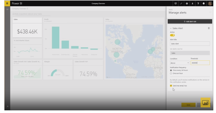
The best way to do that in Power BI is to set an alert that lets you know whenever the number changes. So I’m going to show you how to do that. Now, whenever you’re looking at a dashboard you’ll be able to set an alert on three different types of tiles – It could be a single number tile, a KPI tile or a gauge tile.
In our case we’re interested in sales so we’re going to set it on this tile. To set that alert you open the menu and you pick the little bell-like icon, from there you’ll see an alerts pane open up. From here you can add as many alert rules as you want. Currently, we have none set so go ahead and click Add alert rule.
From here you can do things like set the title for the alert, so I want to call this sales alert and I can set the condition so in our case we want to know when the sales reach is above.
You can also set the notification frequency so you can choose either to set it once every hours or once an hour and what this does is once the threshold of our sales hits you’ll get a notification and if you leave it at once every hour even if your threshold reaches above, again later you will not get a notification until tomorrow and you can also choose to send you an email whenever the alert happens or only if you uncheck this you’ll only get an alert in the notifications pane and Power BI.
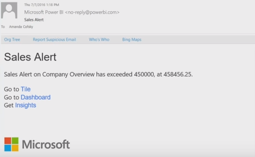
So go ahead and save this and now our alert is set and as the data continues to change, Power BI will check and see if the alert threshold has been hit and once it is you’ll get a notification. So after your day of changes, you’ll see the notification. Now the number has changed so you see that our alert has happened we can see both on the tile itself.
You can see that there has been an alert and we can see it in our notification pane so when we open the notifications pane we can see that our sales alert has gone off and it has exceeded and the actual number. In addition to the alert in the Power BI we also set it so it gives us an email so you can see here I have this email and it tells me that I got an alert in what has exceeded and I can also from here to the tile or the dashboard or even get additional insights if I was curious about why it changed. I think this email helps me keep track of that without having to constantly check Power BI.
So with the power of alerts, you can always know whenever something some data you care about changes and you’ll be able to jump to it and start learning and getting insights from that as well.
Tutorial: Account and Login
The fastest way to sign up for Power BI is to sign up for a Power BI (free) account. There is no charge to this account, and it enables you to use many of the features accessible in the service.
To sign up for Power BI, you can do the following.
- Browse to powerbi.com.
- Select Sign up free or Start Free.
- On the get started page, choose the Try Free option > under Power BI.
- Register the email address you are signing up with, and then select Sign up.
- You will get a notification intimating to check your email.
- Click the link in the email to verify your email address. This will bring you back to the sign-up page. You may be required to supply some extra information regarding yourself.
- You will then be redirected to https://app.powerbi.com and you can start using Power BI Service as a free user.
Power BI Service and CRM Tool
Several people use Salesforce to manage their Accounts and maintain track of their Sales. They often use Power BI to visualize data from Salesforce and bring in extra data sources, but that means switching platforms often. This downloadable configuration will help you to embed a Power BI report inside Salesforce, enabling you to see all your data and reports on a single platform.
These files can be uploaded to your Salesforce instance directly, with a couple of minor configuration changes once they’re in the target environment.
What’s new?
March 2018
- Persistent filters in the Power BI Service: All Power BI reports will now itself retain the filters, slicers, and other data view changes that you have made. You no longer need to invest your valuable time slicing and dicing your report and to repeat the same steps each time you return to the service. With this feature update, you will be able to pick up right where you left off last time and pronto get your insights! To see persistent filters in action, simply head to any Power BI report. You will notice a new button on the top bar that reads Reset to default. By default, this is disabled. It essentially means that you are viewing the author’s published view of the report and have not made any changes.
- Share Feature: Share content with users using their personal e-mail accounts.
Excerpt Credits: Analyzing and Visualizing Data with Power BI by Will Thompson, Program Manager @ Microsoft
Image Credits: Microsoft