
Using Excel for Statistical Analysis
MS Excel is one of the most commonly used tools for data analysis. The convenience of use and cost are two very important reasons why most data professionals prefer using Excel for statistical data analysis. However, using Excel for statistical analysis requires clarity of thought, data analysis knowledge, and strong decision-making skills.
Whether you are performing statistical analysis using Excel 2010 or Excel 2013, you need to have a clear understanding of charts and pivot tables. Most data analysts using Excel for statistical analysis depend largely on these two Excel features. Having knowledge of the essential statistics for data analysis using Excel answers is a plus.

Remember to install Data Analysis ToolPak if you are using Excel for statistical data analysis. In this discussion, we explain in detail the essential statistics for data analysis using Excel and how to perform descriptive analysis using Excel.
In this blog, I have tried to explore the functionalities of MS-Excel as a potential tool for statistical analysis and suggested some simple tricks and techniques that will save both time and energy.
Download Detailed Brochure and Get Complimentary access to Live Online Demo Class with Industry Expert.
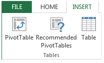
Using Excel for Statistical Analysis: Pivot Tables
A PivotTable is an Excel tool for summarizing a list into a simple format. It helps you analyze all the data in your worksheet so as to make better business decisions. Excel can help you by recommending, and then, automatically creating PivotTables, which are a great way to summarize, analyze, explore, and present your data.
A pivot table may be used as an interactive data summarization tool to automatically condense large datasets into a separate, concise table. You can use it to create an informative summary of a large dataset or make regional comparisons between brand sales.
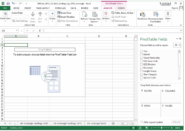
You can create PivotTables from lists, as you define which fields should be arranged in columns, which fields should become rows, and what data you wish to summarize.
Using Excel for Statistical Analysis: Descriptive Statistics
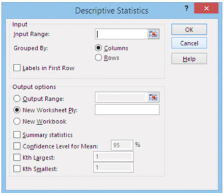
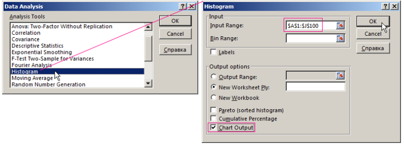
Descriptive Statistics tool in the Data Analysis add-in can be used on an existing data set to get up to 16 different descriptive statistics, without having to enter a single function on the worksheet. Descriptive Statistics gives you a general idea of trends in your data including:
- The mean, mode, median and range
- Variance and standard deviation
- Skewness
- Sample Variance
- Kurtosis and Skewness
- Count, maximum and minimum
Descriptive Statistics is useful because it allows you to take a large amount of data and summarize it. For example, you may want to represent the incomes of a community. Instead of showing it on an excel, you may summarize it, it becomes useful: an average wage, or a median income, is much easier to understand and then analyze the data.
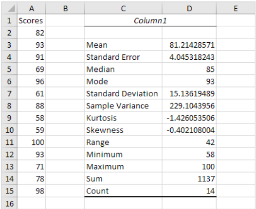
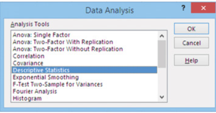
You can find descriptive analysis by going to Excel→ Data→ Data Analysis → Descriptive statistics. It is the most basic set of analysis that can be performed on any data set.
Using Excel for Statistical Analysis: ANOVA (Analysis of Variance)
Analysis of variance (ANOVA) is a statistical technique that is used to check if the means of two or more groups are significantly different from each other. ANOVA checks the impact of one or more factors by comparing the means of different samples.
ANOVA method in Excel shows whether the mean of two or more data set is significantly different from each other or not. In other words, ANOVA analyses two or more groups simultaneously and finds out whether any relationship is there among the groups of data set or not.
For example, you may use ANOVA if you want to analyze the traffic of three different cities and find out which one is more efficient in handling the traffic (or if there are no significant differences among the traffic).
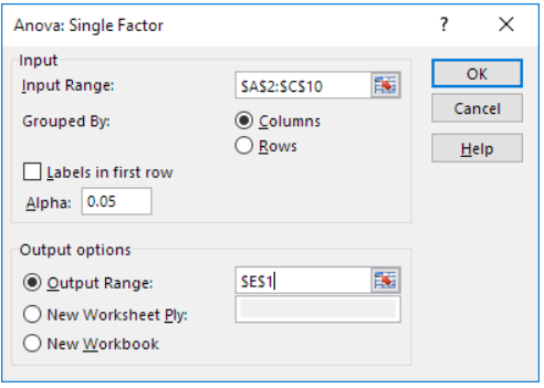
You will find three types of ANOVA in Excel:
- ANOVA single factor
- ANOVA two factor with replication
- ANOVA two factor without replication
If you have three groups of datasets and want to check whether there is any significant difference between these groups or not, you can use ANOVA single factor. If the P-value in the ANOVA summary table is greater than 0.05, you can say that there is a significant difference between the groups.
Using Excel for Statistical Analysis: Moving Average
Moving Average, another great tool for those using Excel for statistical analysis, is ideal for time series data such as stock price, weather report, attendance in class, etc. Moving Average is used extensively in stock price as a technical indicator. If you want to predict the stock price of today, the last ten days’ data would be more relevant than the last 1 year.
You may, simply plot the moving average of the stock having a 10-day period and then predict the estimated price. The same rule may be applied for predicting the temperature of a city. The recent temperature of a city can be calculated by taking the average of the last few weeks rather than the last few months.
Using Excel for Statistical Analysis: Rank and Percentile
The Rank and Percentile, another popular Excel features used for data analysis, is useful for finding the rank of all the values in a list. The best part of using the Rank and Percentile feature is that the percentile is also added to the output table.
The percentile is a percentage that indicates the proportion of the list which is below a given number. It calculates the ranking and percentile in the data set. For example, if you are managing a business of several products and want to find out which product is contributing to a higher revenue, you can use this rank method in Excel.
![]()
In the left table, we have our data on the revenues of different products. And we want to rank this data of products based on their revenue. With the help of rank and percentile, we can get the table shown on the right. You can observe that now the data is sorted and respective rank is also marked with each data.
Percentile shows the category in which the data belongs, such as the top 50%, top 30%, etc. In the summary table, the rank of product 7 is 4. As the total number of data is 7, we can easily say that it belongs to the top 50% of the data.
Using Excel for Statistical Analysis: Regression
Regression is one of the best features in Excel. It is widely used for using Excel for statistical data analysis. Regression is a process of establishing a relationship among many variables; to establish a relationship between dependent variables and independent variables.
Regression is great for use for using Excel for statistical data analysis. You, may, for example, want to see if there is an increase in the revenue of the product, which is not due to the increase in the advertisement.
If you performing statistical analysis using Excel 2010, Regression Analysis is the best way of mathematically sorting out which of those variables does indeed have an impact. It answers the questions: Which factors matter most? Which can we ignore? How do those factors interact with each other? And, perhaps most importantly, how certain are we about all of these factors?
These factors are more commonly known as variables. You may have your dependent or independent variables. In order to conduct a regression analysis, you gather the data on the variables in question.
You may take all of your monthly sales numbers, the past five years and any data on the independent variables you may find useful. You may, for example, find out the average monthly rainfall for the past five years as well.
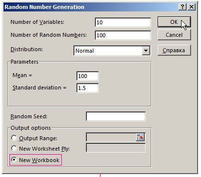
Using Excel for Statistical Analysis: Random Number Generator
If you are using Excel for statistical data analysis, on a regular basis, Random Number Generator must be your top choice for generating a series of random numbers. This simple function in Excel gives you more flexibility in the random number generation process. It gives you more control over the generated data.

A random number is one that is drawn from a set of possible values, each of which is equally probable. In statistics, this is called a uniform distribution, because the distribution of probabilities for each number is uniform (i.e., the same) across the range of possible values.
For example, a good (unloaded) die has the probability 1/6 of rolling a one, 1/6 of rolling a two and so on. Hence, the probability of each of the six numbers coming up is exactly the same, so we say any roll of our die has a uniform distribution.
When discussing a sequence of random numbers, each number drawn must be statistically independent of the others. This means that drawing one value doesn’t make that value less likely to occur again. This is exactly the case with our unloaded die: If you roll a six, that doesn’t mean the chance of rolling another six changes.
Two very essential statistics for data analysis using Excel:
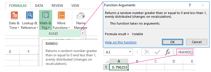
- The function RANDBETWEEN returns a random integer number
- The function RAND () returns a random real number of a uniform distribution. It will be less than 1 and greater than or equal to 0.
Using Excel for Statistical Analysis: Sampling
Sampling is one of the most readily preferred Excel tools if you are using Excel for statistical data analysis. This option is used for creating samples from a huge population. You can randomly select data from the dataset or select every nth item from the set.
For example, if you may want to measure the effectiveness of female call center employee in a call center, you can use this tool to randomly select few data every month and listen to their recorded calls and give a rating based on the selected call.
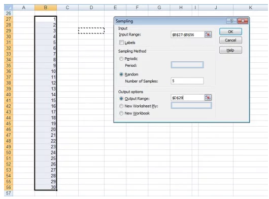
Sampling Methods:
If you are using statistical analysis using Excel 2010, you can make use of two sampling methods in Excel for retrieving or identifying items in your data set:
- Periodic: In this case, you specify the Period n at which you want sampling to take place. The nth value in the input range and every nth value thereafter is copied to the output column. Sampling stops when the end of the input range is reached.
- Random: In this case, you specify the Random Number of Samples. This number of values is drawn from random positions in the input range. A value can be selected more than once. (I.e. sampling is with replacement).
The data science field is booming to such an extent that our earlier analysis of employment reported that there are currently more than 97,000 job openings in India for analytics and information science. Thus, building a career in Data Science is quite in trend these days as the Data Science domain offers lucrative career options.
Excel is one of the most dynamic and intriguing tools for statistical analysis. We have discussed a few features. Play around with Excel to know more about other tools and techniques. You may also look for essential statistics for data analysis using Excel answers.
We offer one of the best-known courses in the Certified Data Analytics Course. The course enables you to learn tools such as Advanced Excel, PowerBI, and SQL. The live projects and intensive training program also empower you to come up with solutions for real-life problems.


Excellent!! You Provided Very Useful Information In This Article. Such A Useful And Very Interesting Stuff, I Have Read Many Articles On Various Sites But This Article Is Giving An In-Depth Explanation About Data Analytics And Its Types. Thank You Very Much For The Very Organized Data Analytics Tips I Learned A Lot From It. I Really Loved This Write Up. It Is Very Useful For Quick Reference.